No items found.
No items found.

Data is everywhere! Data might be present in every aspect of our lives, from the number of ice cream flavors sold locally to frequent fliers traveling internationally. However, what matters is how the insights derived from relevant data are presented cohesively to audiences.
In a professional setup, the ability to present a data analysis report influences decision-making and fosters better equations with executive stakeholders.
Mastering the art of presentations can elevate the impact of your data analysis report. In this blog, we will explore strategies for ensuring that your report leaves an impactful impression on your audience.
A data analysis report is a document that provides insights from quantitative and qualitative data points. This report covers all business domains, such as sales, marketing, operations, and R&D. For example, it can help sales executives with conversion rates success, win/lost account analysis, potential client acquisition, prospecting different revenue sources, cross-functional process optimization, etc.
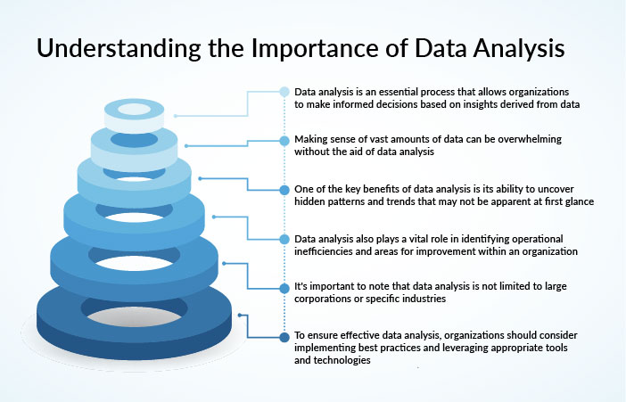
Senior management, leaders, executives, and managers rely heavily on insights from data to define action plans and strategies. Regular monitoring and reporting can help leaders understand businesses as a whole and individually. Different departments can analyze their work to boost their KPIs in real-time.
A well-crafted data analysis report provides clarity through the logical progression behind the conclusions, providing a good understanding of the data's importance. It also ensures that the report is informative and engaging to its readers. When creating a data analysis report, it's essential to consider the following key components:
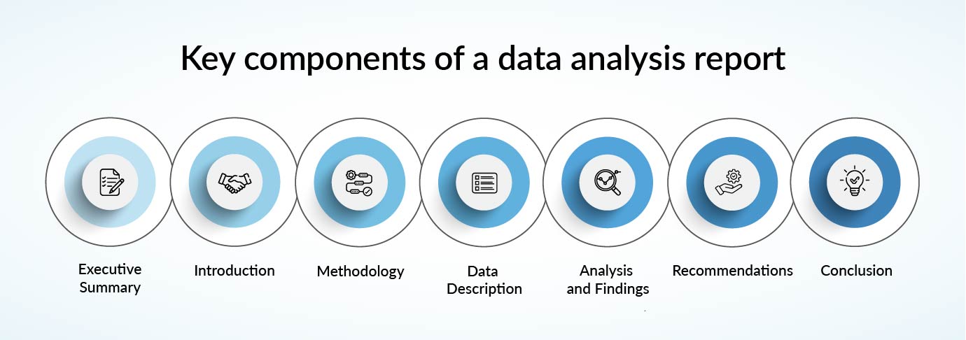
Executive summary: Start with a concise yet informative summary of the research objectives, methodologies used, important findings, and resulting recommendations. This digestible summary should be a quick reference for stakeholders and team members who must grasp the report's fundamental outcomes.
Introduction: Set the stage for the research by outlining the problem, research objectives, and significance of the study. It also lays the foundation for the data analysis and the report's goals.
Methodology: Validate the study's credibility by detailing the data collection and analysis methods used. It outlines the data sources, sample size, and analytical approaches to ensure the rigor and accuracy of the findings.
Data description: Account for the analyzed dataset(s) and any pre-processing or cleaning procedures. It explains the dataset's attributes, including relevant variables, temporal scope, and unique characteristics.
Analysis and findings: This section should present the results of the data analysis through statistical summaries, graphical representations, and interpretive narratives. This helps to make the conclusions understandable for your readers (by explaining the reasoning behind the insights).
Discussion: Explore the implications of the findings, including result interpretation, acknowledging limitations, and contextualizing the results with existing research or knowledge. It may also propose hypotheses for unexpected findings or suggest areas for further study.
Findings and recommendations: This section proposes actionable directives based on the findings and discussions. The recommendations should be practical and firmly rooted in the data analysis.
Conclusion and references: Summarize the key findings and their implications, tie together the report's elements, and highlight the broader significance of the findings. It is better to list all sources used to support the report's scholarly foundation. Include appendices that provide supplementary information, such as various sources of data, complex tables, advanced statistical analyses, etc.
Now that you know the key elements to make an effective Data Report, let’s dive into how to present your Data Analysis Report effectively.
Here are some strategies for engaging stakeholders through data reports, emphasizing the importance of clear communication and tailored presentations. It also explores how to address different stakeholder preferences and the potential impact of data presentation on organizational decision-making.
Understanding your audience is very important before delving into the depths of data analytics or reports. For example, senior executives may seek high-level insights and actionable recommendations, while analysts prefer in-depth data exploration. Tailoring your presentation to the audience's level of expertise is vital to convey your message and create an impact.
A well-structured report acts as a guiding light, logically and coherently leading your audience through your findings. Storytelling with all the data can keep your audiences engaged better.
Add an introduction that contextualizes the analysis and outlines its objectives. Begin with an executive summary that captures your key insights and outcomes. The methodology, data analysis, and findings should be presented clearly and concisely. Prezent’s Story builder makes it easy to weave a storyline.
Visualizations are essential in conveying complex data. Present your insights using charts, graphs, and tables that make your data accessible and engaging.
Your charts and designs should be clean, appropriately labeled, and accompanied by insightful commentary to provide context and aid interpretation. You can use a data visualization dashboard or other visualization tools to convey your message to your audiences effectively.
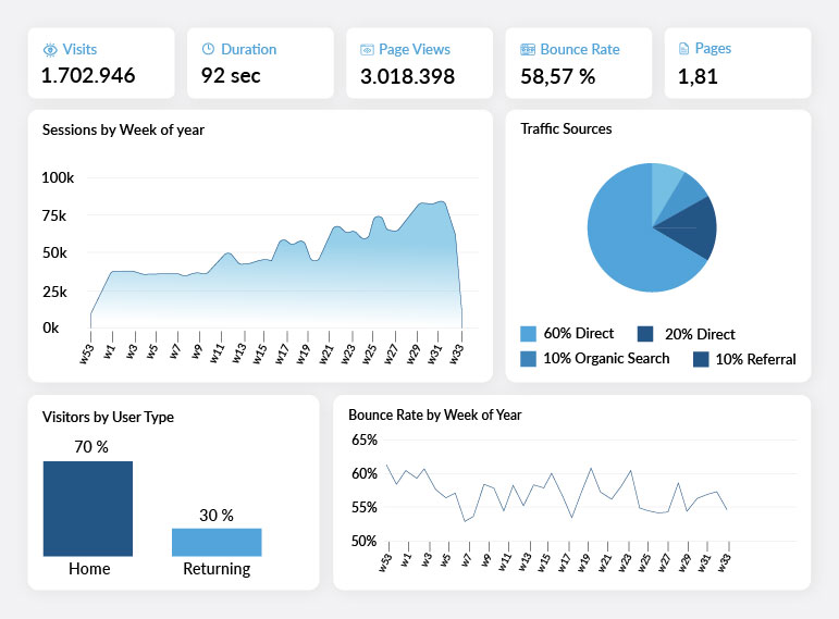
An important point to note is to use appropriate visualization for your data. For instance, bar charts can be used to compare categories, line charts can illustrate trends over time, pie charts can depict composition, etc.
Drawing attention to the most critical insights is vital in a data-laden landscape. Use summaries, bullet points, and visual cues like colors or brand icons. By providing context for these findings, you can help your audience understand their significance and implications more effectively.
A data analysis report should not simply present data but ignite action. Based on your findings, offer clear, actionable recommendations that are practical, feasible, and aligned with the report's objectives. Link each recommendation to specific data points to reinforce validity and maximize potential impact. Concluding with actionable recommendations and proposed next steps can provide tangible value to your audience.
After presenting your report, actively seek feedback from your audience. This can provide valuable insights into how you can enhance future reports and presentations. Additionally, it shows your zeal for learning and improvement, as well as your commitment to engaging with your audience's specific needs.
Review your presentation for inconsistencies, considering the tone and style to make it accessible and engaging. Consider making your presentation interactive through AI-powered analytics to empower stakeholders to explore the data effortlessly.
Mastering effectively presenting a data analysis report is a skill that combines clear communication, visual storytelling, and strategic insights. Implementing these strategies ensures that your report conveys data, inspires action, and helps in decision-making across various departments.
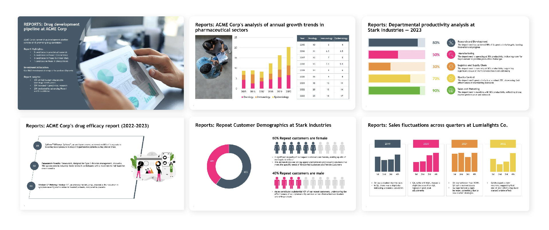
Ultimately, your presentation's goal is not just to present data but to transform it into meaningful insights that drive positive outcomes and facilitate informed decision-making. The Prezent report slide template is a strategic tool for presenting key findings, insights, and data from a report in a concise and visually appealing format.
This template offers a structured format for summarizing a report and highlighting the most important information for presentation purposes. With Prezent's report slide template, you can:
A data analysis report helps with the logical progression behind the conclusions, providing a good understanding of the data's importance. It also ensures that the report is informative and engaging to its readers, yet creating an effective presentation can be time-consuming.
To enhance your presentations, take advantage of presentation templates and slides by Prezent. These tools can streamline the creation process, ensuring your presentations are professional and impactful.
Learn more about Prezent’s capabilities and functions by scheduling a demo at your convenience, or explore the platform using your free trial today!


.png)