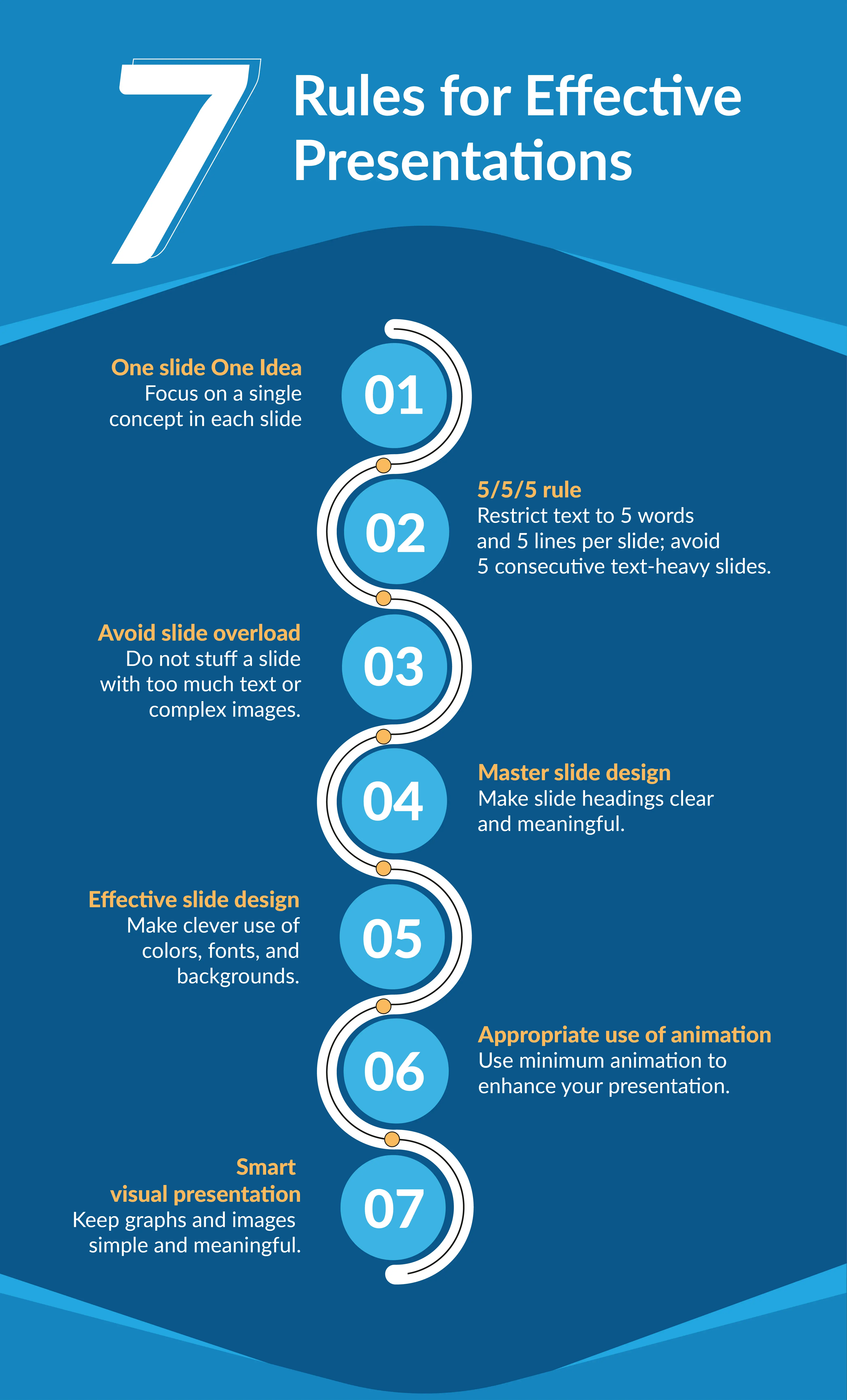
7 Simple rules to help you create effective powerpoint presentations

Presentations are powerful tools for conveying information and at the same time engaging the audience so that they retain the information that is shared. However, creating an impactful and engaging PowerPoint presentation requires adherence to certain rules. In this guide, we'll explore key principles to help you craft presentations that captivate your audience. Also, we will discuss some tips and common mistakes in creating an effective presentation.
Implementing effective presentation techniques
To create an effective presentation, you need to know the basic techniques first. Think of these techniques as the building blocks for your presentation. Once you have these basics in place, you can then make improvements to make your presentation even better. This might mean adjusting things as you go based on how your audience is reacting, being open to changing your content on the spot and adding interactive elements to keep everyone engaged.
Rule 1: Engaging and memorable in just one slide
When you present one idea per slide, you allow your audience to focus on a single concept, making it easier for them to comprehend and remember. Complex ideas can be overwhelming, so breaking them down into smaller, digestible pieces helps your audience follow your message more effectively.
Rule 2: Following the 5 rules for creating effective presentation slides
Spend only one minute or less on each slide to keep things lively and avoid overwhelming your audience. The 5/5/5 rule is a simple guide to keep things short and sweet. Stick to five words per line, no more than five lines per slide, and steer clear of having five slides in a row with lots of text. This way, your audience won't feel bombarded with too much information, and you can share details in manageable bits. This helps keep your audience engaged and paying attention.
Rule 3: Avoiding slide overload for clear messages
Putting too much stuff on slides can make it hard for people to read and listen. To follow Rule 1 (about having one idea per slide), limit your elements to six or fewer on each slide. This keeps things focused. Also, use short text, add some space (white space), and include images or graphics smartly. Doing this helps you deliver your message effectively, making it easier for the audience to remember what you're sharing.
Rule 4: Mastering slide design to get your message across efficiently
The title at the top of each slide is like a signpost for your message. A clear and meaningful heading acts as a cue, helping your audience understand what's coming up. Make sure your heading is a short and clear summary of what you'll talk about on that slide. Everything on the slide should support that heading, like a team working together. This makes it easy for your audience to follow your message smoothly. Keep it concise and to the point!
How to create engaging slides?
Visuals are crucial for creating engaging slides. Think of making presentations like crafting art, where colors, fonts, and images play pivotal roles. Let's delve into each of these factors to understand their significance and technique in detail.
Rule 5: Utilizing effective slide design
Picking the correct font and its color is crucial. It doesn't just make things easier to read but also boosts how well your presentation works. To make words clearer, go for colors that stand out, keep backgrounds simple, and use big fonts. This helps everyone see and understand your slides better. Stay away from italics, underlining, or all caps because they might take attention away from your main message. Keep it simple and easy on the eyes!
Rule 6: Using appropriate animation and transitions
Try to steer clear of using too many animations. Studies indicate that people generally don't enjoy a lot of movement in a presentation. While animations can make things interesting, it's important to use them sparingly. Small, subtle animations can help highlight key points and make your audience remember things better. But, if you use too many flashy movements, it might distract people and make your presentation less effective.
Rule 7: Implementing visual presentations such as graphs and images
Visual elements, such as images and graphs, add interest and engagement to your presentation. However, it's essential to strike a balance. Avoid overly complex graphics that may confuse your audience. When you decide to use a graph or chart, make sure to explain what it shows so everyone understands the information you're sharing. Keeping things clear and simple ensures your visuals add to the presentation without making it confusing.

Tips for delivering successful PowerPoint presentations
Adhering to the presentation rules will help you enhance the audience experience, but also ensure the efficient delivery of your PowerPoint presentation. There are a few presentation tips that will not only assist you in following the rules discussed above but will also develop the necessary skills to keep your audience engaged.
Strategies for engaging content:
To make your presentation more engaging try to craft a compelling narrative that resonates with your audience. You can share relatable stories to evoke emotions that can help in making your topic more relatable and interesting. Choose visually appealing slides and break down complex concepts into digestible bits that can be easily understood and retained. Enhance interactivity by incorporating questions, polls, and activities to infuse life into your presentation. This dynamic approach ensures your audience stays not just informed but actively involved throughout your talk.
Know your audience:
Tailor your presentation to the needs, interests, and knowledge level of your audience. Understanding your audience allows you to adjust your content and tone accordingly.
Developing presentation skills:
Refine your presentation skills to captivate your audience. Practice confident body language, maintain consistent eye contact, and modulate your voice for emphasis. These practices not only boost your credibility but also amplify your persuasive impact. Engage with your audience to build a connection, intensifying the impact of your message.
Enhancing understanding with simple rules:
Adhere to straightforward presentation rules to enhance audience comprehension. Utilize clear and concise headings, limit the text on each slide, and incorporate visuals strategically. Ensure that your message is easy to follow and doesn't overwhelm the audience with unnecessary details.
Maximizing slide impact:
Each slide should contribute significantly to your message. Highlight key points, use visually striking elements, and maintain a clean design. Colors and fonts play a very important role. Eliminate unnecessary clutter, ensuring that every component on the slide serves a specific purpose.
Efficient presentation delivery:
Focus on delivering your presentation with efficiency. Practice your timing to ensure a smooth flow, avoid unnecessary technical jargon, and actively encourage audience participation. Keep the presentation dynamic and engaging to sustain interest from the beginning to the end.
Common mistakes to avoid in PowerPoint presentations
Let's take a closer look at the common mistakes we often see and find the best ways to avoid them.
Avoiding overloaded slides and complicated visuals:
Resist the temptation to overload a single slide with excessive information or complex data charts. Keep it simple and focused to ensure your audience easily grasps the key points without feeling overwhelmed. The "Rule of One Slide, One Idea" emphasizes steering clear of overstuffed slides, allowing for a more effective and digestible presentation.
Minimizing the use of text-heavy slides for maximum impact:
Presenters sometimes put too much text on slides to help them remember what to say. However, this can make the audience lose interest and the message isn't as clear. Don't drown your slides in text. Use short and impactful messages. Use visuals, bullet points, and brief text to convey your message effectively, keeping your audience's attention intact.
Avoiding ineffective presentation design elements:
Every visual and layout choice should enhance your message and not distract or confuse your audience. Therefore, stay clear of design elements that don't contribute meaningfully to your presentation.
Avoiding fonts that are difficult to read or understand:
Choose fonts wisely. Select clear, readable fonts that ensure your audience can easily comprehend your content. Avoid italics or complex fonts that may hinder rather than aid understanding. Consider using a font size of 30 points or larger. This ensures readability for people sitting at a distance and those with vision impairments, enhancing the overall accessibility of your presentation.
Benefits of following the presentation rules
Following these presentation rules results in more engaging, comprehensible, and impactful presentations that effectively convey messages to the audience.
Audience engagement:
Following the rules maintains audience engagement by preventing information overload. Limiting each slide's content ensures details are shared in manageable bits, adding interest with visuals while ensuring clarity. Explaining visuals contributes to better audience understanding.
Impactful delivery:
Basic guidelines, such as limiting elements per slide and employing clear headings, enhance message delivery. These rules facilitate focused communication, progressive build-up on complex topics, and seamless audience guidance, resulting in improved understanding.
Visually appealing:
By following rules to enhance visual appeal in your presentation, such as choosing readable fonts, high-contrast colors, and simple backgrounds, you not only improve the aesthetics but also facilitate better information retention for your audience. This is supported by data indicating that individuals process images at a rate 60,000 times faster than text, with 90% of information transmitted to the brain being visual.
Improves retention:
Emphasizing a single, digestible idea per slide enables focused comprehension and better retention. The use of subtle animations to highlight key points enhances audience retention, avoiding excessive movements that may distract from the presentation's effectiveness.
How Prezent help you make an effective presentation in less time?
Understanding the challenges faced by businesses to adhere to the presentation rules, Prezent brings in features that makes the task easier for presenters.
Hyper-personalized presentation: Prezent’s Fingerprint feature helps you understand your audience's preferences, allowing you to customize your presentation accordingly. This ensures resonance with the audience, enhancing its overall effectiveness.
Slide library for visual appeal: You can access the Slide Library to choose background images, layouts, and graphical charts for your data. Prezent facilitates easy audience engagement with compelling imagery, elevating the visual appeal of your presentation.
Compelling narratives with storyline: You can leverage Prezent's Storyline builder, which offers over 35,000 pre-built narratives. These structured storylines assist in breaking down complex topics into easily understandable information, creating an impactful and engaging presentation experience.
Real-time collaboration: The real-time collaboration feature facilitates seamless teamwork, allowing multiple contributors to work on the presentation simultaneously. This collaborative approach fosters efficiency, ensuring that the collective efforts result in a well-coordinated and polished final product.
Brand compliance: Prezent enables swift alignment with established brand standards, ensuring 100% brand compliance in just a few minutes. Transform your slides seamlessly to achieve a harmonious blend of colors, fonts, and visuals. This ensures a consistent reflection of your brand's standards, guaranteeing a professional presentation every time.
Follow these essential presentation rules to ensure your message has a lasting impact. To enhance efficiency in your business communication and presentation creation process, explore Prezent with a free trial. Schedule a demo to experience all the product features and understand the value it can add to your business.


