No items found.
No items found.

Let’s be real—most of us would rather look at a well-designed infographic than read through a dense report. The reason is simple: visual communication makes complex information more accessible to understand and a lot more engaging. It’s everywhere, from the pie chart in your company’s presentation to the logo that defines your favorite brand. So, what exactly is visual communication, why is it so effective, and how can you use it to engage your audience and make your message stick?
In this article, we’ll look into the types of visual communication, the design principles that make it effective, and how you can incorporate visuals into your workplace strategies. We’ll also explore real-world examples of visual communication that have made an impact. Let's break it down.
At its core, visual communication is the practice of using visual elements—such as images, graphics, videos, and symbols—to convey information and ideas. Rather than relying on text alone, this approach taps into our brain’s preference for visuals. Think about it: Wouldn’t you rather understand sales trends with a data visualization or pie chart than read a long paragraph?
Whether you’re a marketer promoting a product or service, a designer creating a visual brand, or a team leader sharing project updates, using visual communication can help you get your message across in a way that’s engaging, efficient, and, most importantly, memorable.
There are many different types of visual communication, each suited to specific kinds of information and contexts. Let’s take a look at the most common formats:
1. Infographics
Infographics are one of the most popular forms of visual communication. They combine data, text, and visual elements to create a cohesive story or explanation. Ideal for summarizing reports, research, or statistics, they are perfect for making complicated data easier to understand.
2. Data visualization
Pie charts, bar graphs, and line graphs fall under data visualization. These formats help you translate raw numbers into something people can easily grasp. Whether you’re sharing financial performance or customer satisfaction metrics, data visualization tools help to present key insights at a glance.
3. Graphic design
Graphic design includes everything from creating marketing materials like posters and ads to designing a brand’s overall identity. Logos, brochures, websites, and even product packaging fall under the umbrella of graphic design. The goal is to communicate a message visually while maintaining a cohesive visual brand.
4. Visual storytelling
This is a powerful way to convey emotion and meaning through images and videos. Visual storytelling takes your audience on a journey, often evoking emotional responses to leave a lasting impact. Whether through videos, illustrations, or animated GIFs, visual storytelling is about creating an emotional connection.
5. Presentations
Slideshows and visual presentations are essential in business communication. A well-designed presentation with clean visuals, minimal text, and effective data displays can turn a dull meeting into a dynamic one. The best presentations rely on visual elements like charts and images to keep audiences engaged.
In a world where attention spans are shorter than ever, visual communication isn’t just a tool—it’s a necessity. It’s about making your message stick, quickly and effectively. Here’s why it’s so powerful:
Retention that lasts: We’re visual creatures. Studies show people remember far more from visuals than text. So, if you want your message to linger, a smart infographic or data visualization is your best bet.
Simplifying the complex: When words fall short, visuals step up. A well-placed diagram or chart can break down complex information in a way that’s immediately clear.
Engagement is everything: Visuals demand attention. Whether it’s a striking image or a cleverly designed graphic, they draw your audience in and keep them interested.
Time is money: Why explain what you can show? A quick pie chart or graph conveys meaning instantly, saving both you and your audience precious time.
Mastering visual communication can be the difference between engaging your team and losing them to a sea of text. Whether you're trying to simplify a presentation, onboard a new employee, or convey complex data, visuals help you communicate effectively. Here’s how to make visual communication strategies work seamlessly in your office without overcomplicating things.
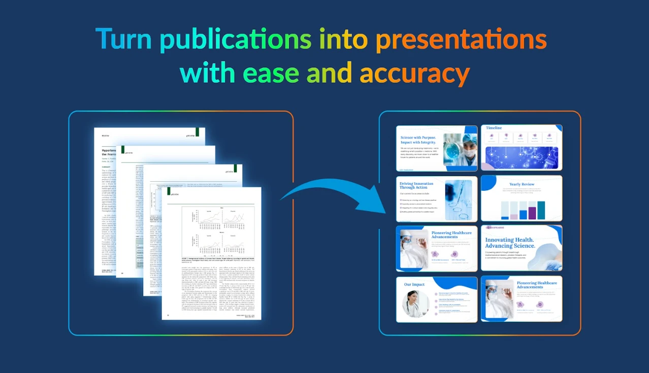
Incorporating visual elements doesn’t mean turning every email into a work of art. Focus on key areas where visuals will make an impact. For example, transform data-heavy reports into clean, easy-to-digest charts or graphs. High-quality images and even animated GIFs can replace a wall of text, getting your point across faster. Instead of writing a long project update, try using visual formats like a dashboard or flowchart to provide clarity.
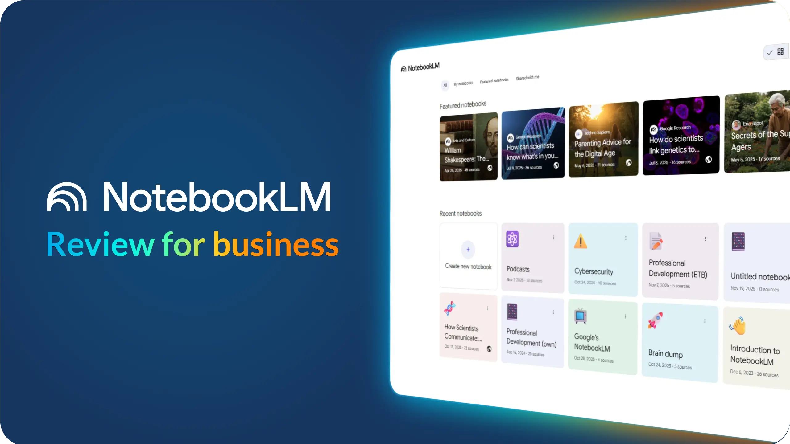
Templates are an excellent way to ensure consistency across your visual materials while saving significant time. Instead of recreating a presentation or report from scratch, lean on pre-designed templates. Tools like Prezent offers a range of customizable options, ensuring your visual communication tools stay aligned with your brand and style. This not only maintains your professional look but also allows you to stay on-brand with high-quality visuals every time.
Different audiences call for different communication strategies. Visuals that work for team members might not resonate with stakeholders or clients. When you’re presenting internally, visuals like timelines or process flows might streamline your workflow. On the other hand, if you're presenting to clients, polished graphics or data-driven visual elements might work best to drive home key points. Always keep the target audience in mind when crafting visual content.
No one enjoys sifting through pages of manuals when starting a new job. Using visuals during the onboarding process can make the experience much smoother for a new employee. Think of simple videos, checklists, and flowcharts that outline job duties or company protocols. These materials help the employee understand their role quickly and feel more confident from day one. Visuals don’t just reduce the complexity; they help create a more welcoming and effective learning environment.
Visuals lose their effectiveness when they become repetitive or outdated. To keep your content engaging, regularly refresh your visual communication assets. Whether it’s updating your presentation slides, creating new marketing graphics, or adding a modern spin to your internal documents, a little visual variety can inspire change and keep your audience interested. Just like a fresh coat of paint, keeping things current goes a long way in maintaining attention.
Having the right tools is one thing, but knowing how to use them is another. To implement strong visual communication, it’s crucial to train your team on tools like Prezent, making it so easy to create professional visuals without needing a designer. By ensuring your team is equipped to produce high-quality images, charts, and presentations, you empower them to communicate effectively while also speeding up processes. When everyone can create and use visuals confidently, you’ll notice improved productivity and clearer communication.
If your message involves numbers, don't leave it buried in a paragraph. Data visualizations, whether through pie charts or bar graphs, make raw numbers far more accessible and easier to understand. The goal is to simplify, not overwhelm. Using visual elements to convey data ensures your audience gets the information they need in an instant—without diving deep into endless spreadsheets.
Here are some specific campaigns that have successfully leveraged visual communication to deliver impactful messages and drive engagement:
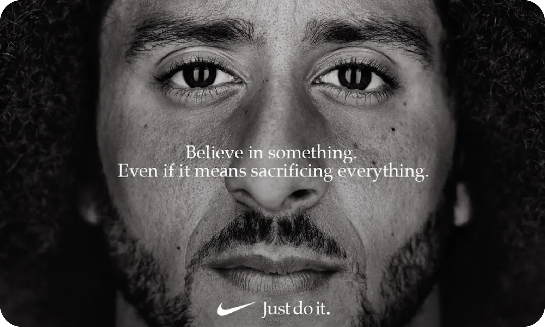
Nike’s Dream Crazy campaign, featuring Colin Kaepernick, is a standout in terms of visual storytelling. The campaign used powerful images and video to promote the message of believing in something bigger, even if it means sacrificing everything.
Takeaway: Nike’s use of simple yet strong visuals created a massive cultural moment. It shows how visual communication can inspire change and provoke thought, aligning the brand with deeper social values.
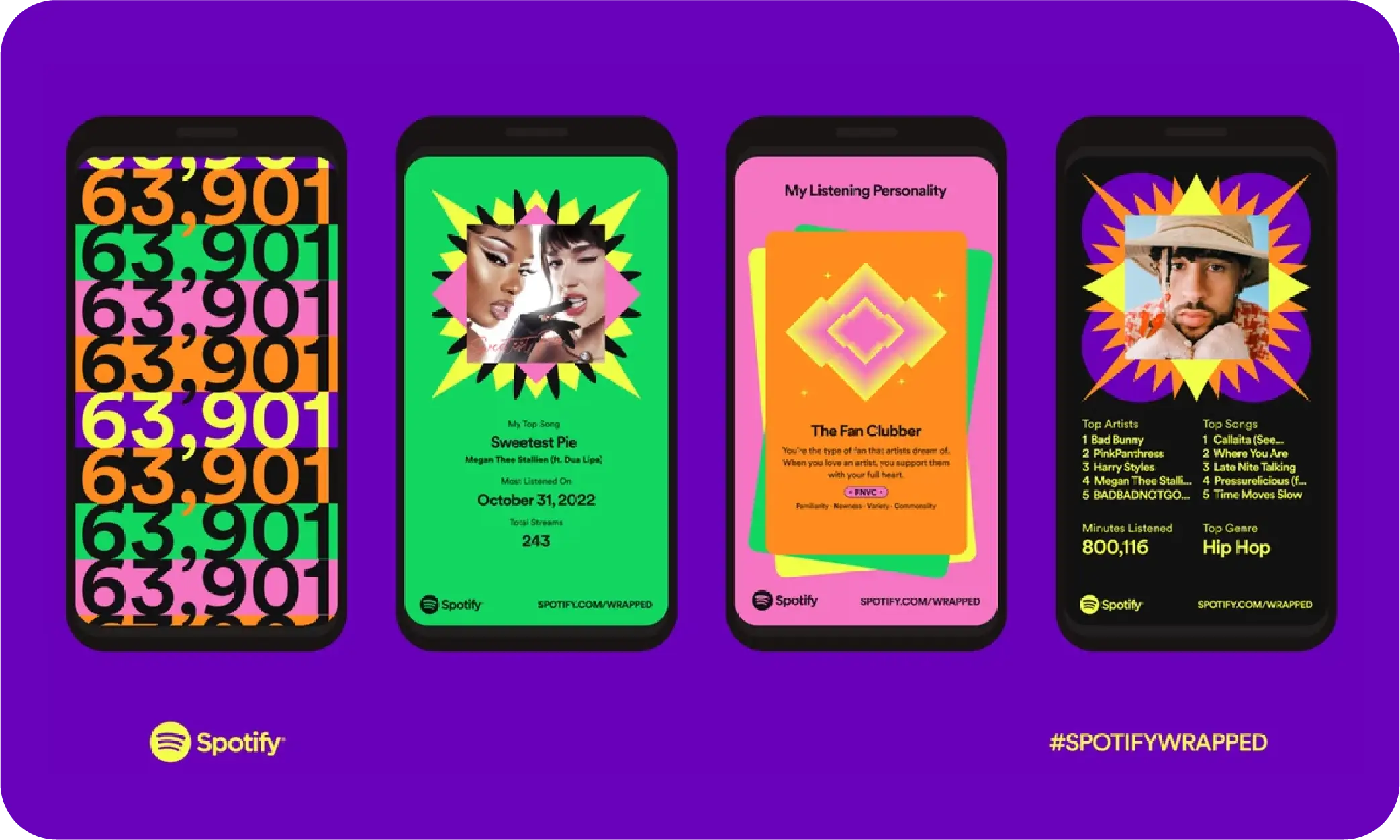
Spotify's annual Wrapped Campaign is a brilliant use of data visualization and personalization. Each year, Spotify users receive a summary of their listening habits through sleek, colorful images that highlight their top songs, artists, genres, and more. The company uses visual communication to transform raw data into fun, shareable content that users can post on social media.
Takeaway: By turning user data into dynamic, shareable visuals, Spotify not only engages its audience but also transforms users into active participants in its branding, showcasing how data visualization can drive widespread social media engagement.
When Tesla launches a new product, it’s not just a press event—it’s a visual experience. The company’s product presentations are masterclasses in strong visual communication. Tesla doesn’t flood the audience with technical specs in text form. Instead, they lean on sleek, high-quality visuals to demonstrate their products in action.
From massive screens that showcase the car’s design and performance features, to visualizations showing the environmental benefits of electric cars, Tesla creates a compelling narrative through visuals. Their presentations don’t just explain the product—they make you feel like you’re part of something futuristic and revolutionary.
This strategy has helped Tesla build a brand that’s not just innovative but also emotionally resonant, driving excitement around every product launch.
Takeaway: Tesla’s approach proves that great visuals don’t just present information—they create anticipation and excitement around your product or service.
Luckily, you don’t need to be a graphic designer to incorporate visuals into your communication. There are tons of easy-to-use tools out there that can help you create stunning visuals:
1. Prezent
2. Canva
3. Piktochart
These tools make it easy for anyone to create professional-looking visuals, no design degree required!
Effective visual communication helps simplify complex ideas, making them easier to understand. It can engage your audience more effectively by using visuals to present information in a way that sticks. Visuals also help break through information overload, ensuring that your visual message is more memorable than a text-only format.
Using visuals to connect with your audience creates an emotional response and helps them engage with your message faster. Visuals convey meaning for your audience in an impactful way, especially for visual learners, who process visual information more effectively than words.
For nonprofits, visual communication helps simplify their message and spread the word about their cause. Whether they are targeting donors or stakeholders, nonprofits can use visuals to make their mission more relatable and engaging, turning a passive viewer into an active supporter.
In internal communications, visuals like create screenshots, charts, or diagrams can help explain complex processes or data to your team. For external audiences, like clients or stakeholders, using professional visual assets such as infographics or video presentations can better represent your products and services.
Absolutely. Visual communication is really powerful because it helps your audience grasp information quickly. Studies show that people remember visual content more than text alone, so if you’re looking to communicate something important, visuals will help your audience retain the message longer and with greater clarity.
To keep your visuals fresh and exciting, use a variety of different elements such as charts, videos, screenshots, or animations. Change things up by regularly updating your visual assets to ensure your content stays engaging and relevant.