No items found.
No items found.

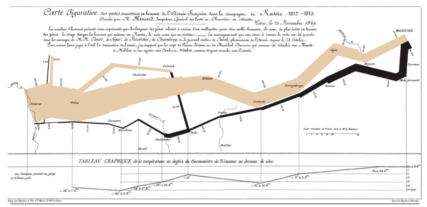
Edward Tufte declared Charles Joseph Minard's chart the "best statistical graph ever drawn." It was a graphic depiction of Napoleon's 1812 advance on Russia. So what does this chart have that others don't, and does it still deserve the title of the greatest chart ever made?
Dive into the history of Charles Joseph Minard and learn tips for how to create a chart that will cause a stir in your business presentations.
Key takeaways:
Charles Joseph Minard was a French civil engineer with a great eye for data. He created several charts and graphs that neatly depicted a collection of information that his audience could easily decipher.
His most famous graph showed Napoleon's Russian campaign of 1812 when he marched 500,000 men from the Neman river to Moscow with disastrous results.
What made this graph so unique?
It contained six pieces of information in a two-dimensional image:
The exponential loss of men during this campaign hit viewers the most when they saw the map. While you can read numbers in a history book, a graph that shows a dwindling line brings the full impact home and incites a more significant emotional response.
The chart is packed full of information. The longer you study it, the more information you learn about the campaign.
Charts and graphs are a powerful way to compare several pieces of information at once. You can convey information concisely through a well-thought-out image, making charts ideal for business presentations where you need to pack textbooks worth of information in a limited space.
Charts and graphs make your business presentations more memorable as most people remember an image more than spoken or written information. This is known as the picture superiority effect. According to one study, the average person only retains 10% of a written text. However, if there are also pictures with the text, the same person remembers 65%. This is mainly because the brain can process images faster than words.
Here are five tips for designing charts just as impactful as Minard's in your business:
While Minard's graph caused quite the buzz, it wouldn't be nearly as effective if you used a similar chart in a marketing presentation. Looking back at the chart, you'll notice how it has a large amount of information, lines, and data squeezed into a small space.
This presentation is a historian's dream. Meanwhile, your other teams have different needs, and spending 15 to 20 minutes deciphering a chart isn't one of their priorities. However, if you could present information in a simple bar graph, you might see a much more positive response.
Understand who is seeing the graph by researching your audience. This will guide you in choosing the best chart and imagery to relate to that audience. For example, are they looking for large amounts of data packed into a single image, or will a simple graph resonate better with them and the information they want to glean from your presentation?
Your audience should have no issues reading the information on the chart. From the first moment you glance at Minard's chart, you can see how the line shrinks along the campaign trail. It was a straightforward 2D graph.
Adding bright colors, shadows, and other elements can often be more harmful than beneficial because it distracts from your main message. It can also make the chart difficult to read and understand. For instance, a shadow might make viewers think it's another bar in your bar graph.
Another often overlooked part of chart creation are your color choices. There are about 300 million people with color blindness. This comes out to 8% of men and 0.5% of women. So using similar colors like yellows and greens can make your chart difficult for some of your audience to understand.
The human eye has a visual hierarchy or the order in which it processes information. When you create a chart, natural colors and shapes will attract the eye first. Then, the eye moves in a predictable pattern around the screen. When you look at Minard's chart, your eye naturally follows the campaign's progression across the page.
To ensure your audience processes the information in the correct order, you can build your chart around this hierarchy.
Here are a few rules to keep in mind when creating presentations with charts:
The primary reason for creating a chart is to provide information without text. If you add too much text, it defeats the purpose of visualizing your data. If you need to add text to clarify the chart, you might want to consider adjusting your chart so it can convey the same message without using words.
The one exception is your title. Every chart should have a large title that immediately tells your audience what the chart is about.
Each chart you create should have its unique message. As you add information, carefully consider if it adds to that message or isn't relevant. If you try to add too much information, the chart will grow cluttered and challenging to read.
Remember that white space is your friend. It's there to highlight essential information. So, before you see white areas as space to fill, consider what message you want to convey. Then use purposeful communication to expound on the image in your presentation rather than adding it all to your chart.
Make your presentations more memorable with visually attractive and information-packed charts that clearly outline your ideas.


.png)