Avoid these common presentation mistakes at any cost

Presentations are a critical tool for communication in the modern professional world, whether in academia, business, or any other field. However, even the most seasoned presenters with great presentation skills can fall prey to common pitfalls that diminish the impact of their presentations. By understanding these common mistakes and learning how to avoid them, presenters can significantly enhance their effectiveness. This article explores these frequent errors and provides practical advice on how to sidestep them.
Mistakes a presenter makes while CREATING a presentation
Creating a presentation is much more than assembling slides and graphics. It involves thorough planning and understanding of the content, the audience, and the context in which the presentation will be delivered. Many presenters, however, overlook these foundational aspects, leading to presentations that are less engaging or effective. Here are some common missteps during the creation of presentation slides and key points on how to avoid them.
Lack of research on the concerned topic
When tasked with delivering a presentation, your initial step should be thorough research. This is the cornerstone of any effective presentation as it not only adds depth to your content but also instills a layer of confidence in your delivery. Skimping on research can lead to a superficial presentation, which might result in losing your audience's interest due to the lack of substantive content.
Tips to research a concerned topic - Start by clearly defining the objective of your presentation and understanding your audience. Utilize credible sources such as academic journals, reputable news outlets, and expert interviews to gather accurate and relevant information. Keep your notes well-organized, possibly using digital tools for ease of access and modification. Incorporate a variety of media formats, including videos, infographics, and podcasts, to enrich your presentation. Always verify your facts with multiple sources to maintain reliability.
Starting directly with the designs
Many people instinctively open PowerPoint when they begin preparing a presentation. They start creating slide designs, either by repurposing old ones or designing new ones, and might feel a sense of accomplishment as they see visible progress—something that can be printed and shared.
However, this approach can be like trying to write a book by starting with individual chapters before having a plot. This often leads to a collection of disjointed sections that are challenging to weave into a compelling narrative. This method not only squanders time but also resources.
Instead, it's more effective to develop a robust talk that minimizes reliance on visual aids. You may discover that your message can stand strong on its own without the need for slides. If visual aids turn out to be necessary, they should ideally be crafted towards the final stages of your preparation process, ensuring they support and enhance your presentation, rather than steering it.
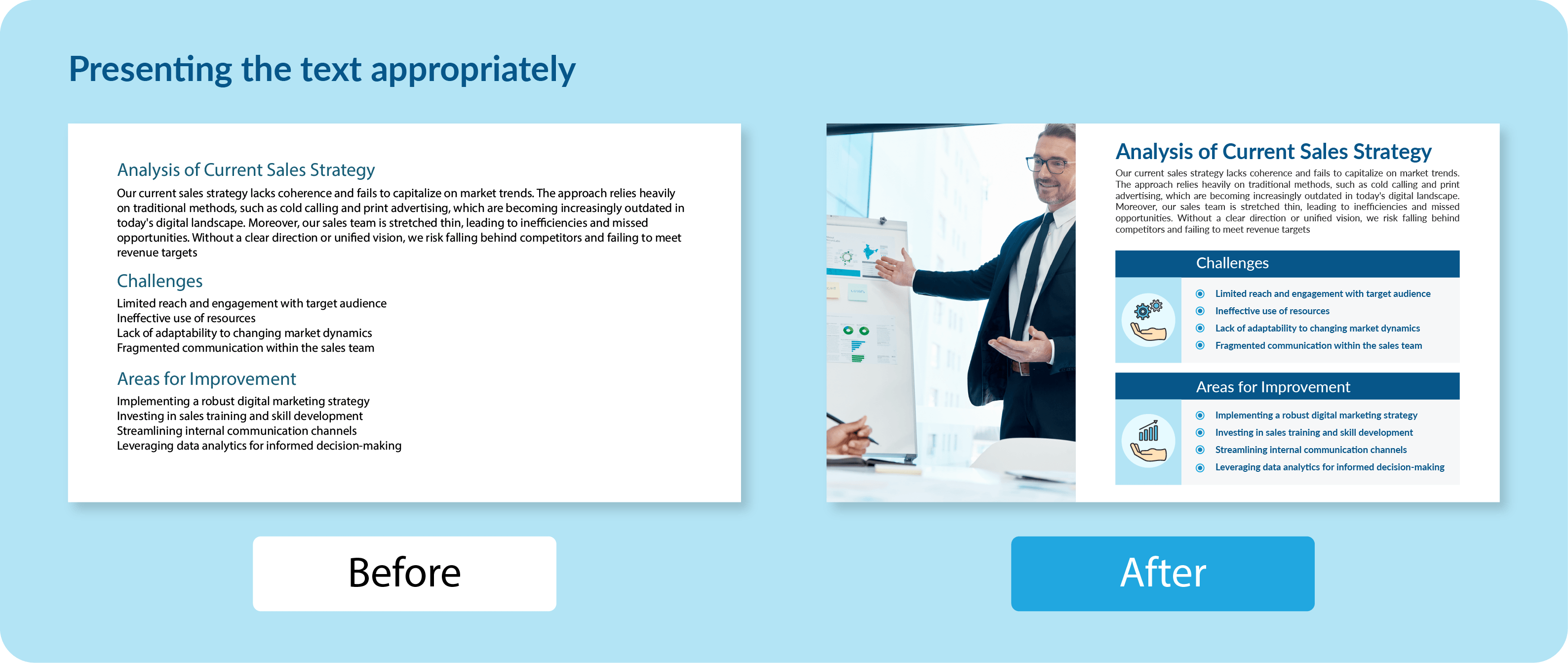
Including too much text on slides
When crafting individual slides, it's crucial to find the right balance between text and visuals. Too much visual content can overpower what might be a strong presentation otherwise. While you aim to deliver substantial content to your audience, it's important to avoid overwhelming them.
Here are some tips: If your slides still appear text-heavy after condensing the content, consider these strategies:
- Use bullet points, headers, and other formatting techniques to enhance readability.
- Switching up the font can be a simple yet effective method to make the text more visually appealing.
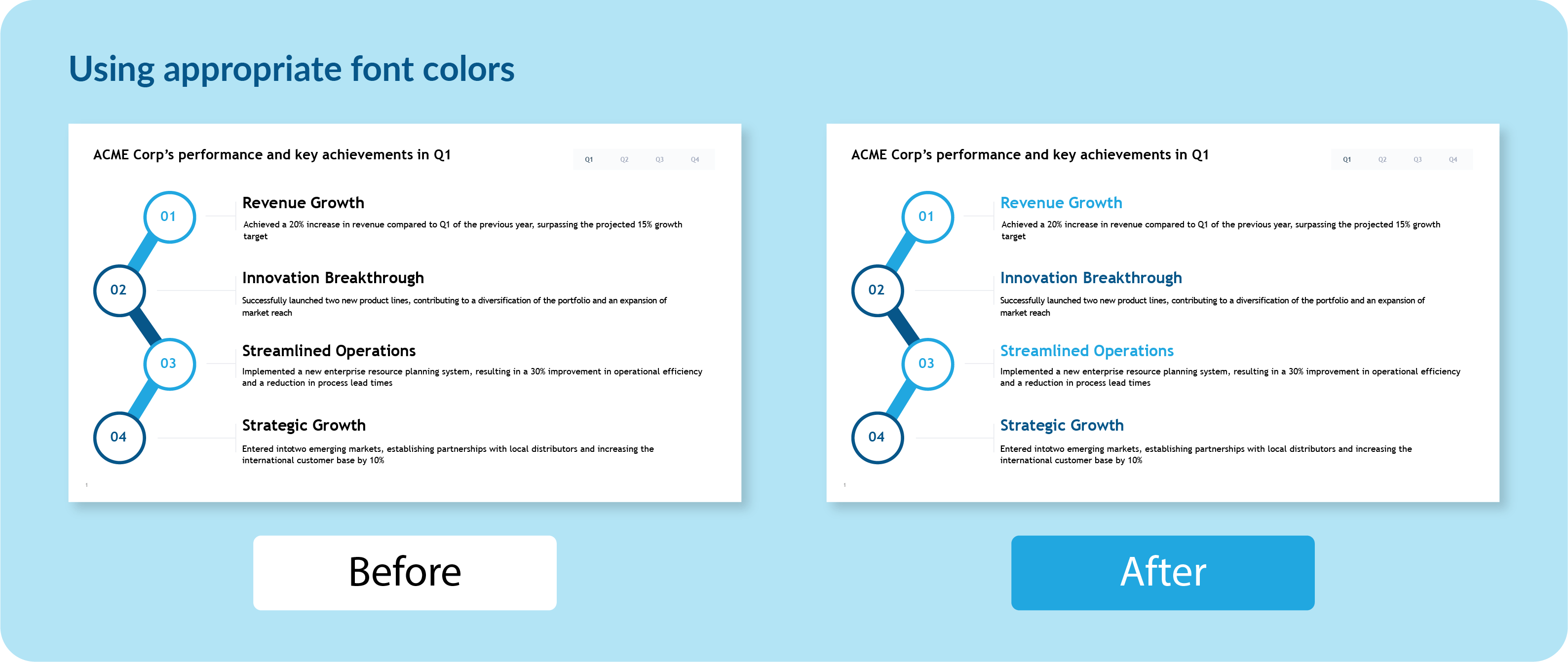
- Black is generally the safest choice for font color, but occasionally, using a different color can highlight critical information effectively.
Using colors that distract
Often, presenters underestimate the impact of colors and choose their slide-deck palettes only at the last moment, which can significantly detract from the effectiveness of a presentation. Certain color combinations, like red and green, might inadvertently bring up seasonal associations, such as Christmas, which may not align with the intended message.
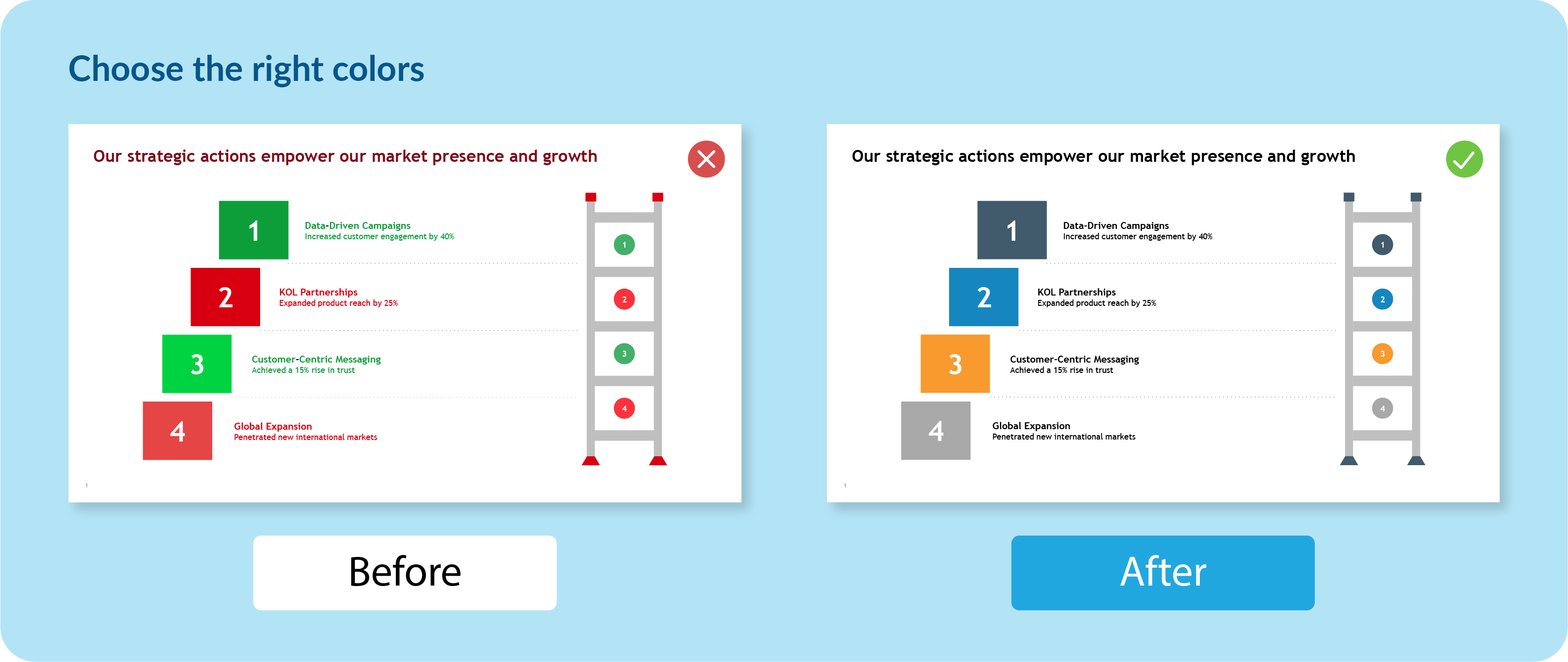
It's essential for presenters to invest time in understanding color theory, as colors can profoundly alter the perception of the information being presented. Choosing the wrong colors can misalign with the emotions you aim to evoke in your audience.
Tips to choose the right color:
- Spend time learning how different colors can influence mood and perception, ensuring that your choices bolster the presentation's message.
- Always use your organization's color scheme to maintain brand alignment and reinforce brand identity.
- Check how your colors appear on different devices and projectors to ensure they are consistently visible.
- Limit your palette to a few complementary colors to avoid visual confusion and enhance the overall aesthetic of your presentation.
Using still images only or too much animation
When creating presentations, presenters often lean too heavily on one type of visual aid, such as relying solely on still images or overusing animations. Using only still images can make a presentation feel static and unengaging, potentially causing the audience's attention to wane. On the other hand, excessive animations can be distracting, pulling focus away from the core message and sometimes even slowing down the presentation flow on less capable systems.
To avoid these pitfalls and strike the right balance in visual aids, consider the following tips:
- Combine still images with other forms of media like videos, charts, and simple animations to keep the presentation dynamic and engaging. This variety caters to different learning styles and keeps the audience interested.
- Incorporate animations only where they add value, such as illustrating a process or highlighting changes over time. Ensure that animations are smooth and professional.
- Choose images and animations that are directly relevant to the content being discussed.
- Always preview your presentation to check the balance and flow of visual elements. Discuss it with your team, take their feedback, and integrate it.
Only data, no story
Another common mistake presenters make is overloading their slides with too much information and not enough narrative. This can lead to a presentation that feels more like a data dump rather than a compelling story. The audience may struggle to connect the dots or understand the overarching message, which can result in disengagement and confusion. Presentations that fail to tell a story often lack emotional resonance, making it harder to inspire action or change.
Tips to enhance your presentations by balancing informative content with engaging storytelling
- Allot space to real-life elements like case studies, anecdotes, or testimonials. These elements can humanize your data and connect emotionally with the audience, making complex information more relatable and memorable.
- Utilize storytelling tools designed to help structure your presentation's narrative more effectively. Explore tools like Prezent, which has a unique storybuilder feature recommended for large enterprises, or Microsoft Sway, which offers easy-to-use templates and visuals, helping you organize your points around a central theme.
Creating the same presentation for different audiences
Knowing your audience is crucial for tailoring a presentation that resonates and engages effectively. Different audience members have varying expectations, backgrounds, and interests, which should guide how you structure and deliver your presentation. It’s best to customize a presentation for different audiences. This helps keep your audience's interest alive.
For example, when presenting a financial forecast to executives, they will typically want an executive summary of the financial forecast first, focusing on key figures, growth projections, and strategic implications. They prefer a concise overview that allows them to quickly grasp the financial health and future direction of the company before deciding if a deeper dive is necessary.
In contrast, the finance department would require a detailed breakdown of the same forecast. They would be interested in the specific assumptions made, variance analyses, and detailed financial models. For them, complex terms and extensive data are essential and expected.
Tips to build presentations according to your audience's style
- Explore and utilize tools that can help you understand audience strengths, preferences, and areas for growth, while also providing personalized insights to enhance your communication skills.
- Create flexible content that includes both high-level summaries and detailed appendices or technical sections. This allows you to adjust the content dynamically, depending on who is in the audience.
- Before the presentation, ask attendees about their expectations and any specific topics they want covered. This feedback can refine your focus and ensure the presentation addresses the audience’s needs.
Using the wrong presentation maker
No matter how confident you are in your body language, public speaking abilities, or how well you've prepared and researched your topic, choosing the right tool for building your presentation is crucial. The market offers a variety of tools, each tailored to specific needs, so selecting the appropriate one can significantly enhance your presentation's impact.
Here are a few options:
- Canva - Known for leveling the design playing field, Canva provides a vast array of customizable templates and innovative features like Magic Design. This tool is ideal for users of all skill levels who want to produce sleek, professional designs effortlessly.
- Beautiful.ai - The platform is designed for users who want to create presentations efficiently, with a focus on design and layout optimization only.
- Templafy - Best suited for people aiming to maintain brand consistency across their documents, Templafy integrates with PowerPoint to provide users with easy access to corporate-branded templates.
- Prezent - This tool adopts a comprehensive approach to presentation creation. It not only helps in crafting slides but also focuses on developing engaging narratives. With its vast slide libraries and educational modules on business communication, Prezent is particularly favored by large and mid-market organizations for its ability to streamline complex business storytelling.
Explore the capabilities of Prezent and discover how it can transform your business communications by scheduling a demo. Alternatively, you can embark on your journey of discovery by exploring its features firsthand by opting for a free trial.
Mistakes a presenter makes BEFORE giving a presentation
Before diving into specific pitfalls, it's essential to recognize that the preparation phase is as crucial as the delivery of your presentation. Many presenters focus extensively on the content of their slides and the delivery techniques but overlook critical preparatory steps that can make or break their presentation. Ensuring everything is in order before you step in front of an audience is key to delivering a successful presentation. Avoiding these common mistakes will not only boost your confidence but also enhance the effectiveness of your communication.
Not checking if the presentation files are working
When presenting, whether to a small group or a large audience, ensure that you can access and run your presentation smoothly. Regardless of the software you use—PowerPoint, Keynote, or Google Slides—it's crucial to confirm that your slides are ready to go. Problems accessing your presentation can quickly undermine the confidence of potential investors or important stakeholders.
Tips to avoid this common presentation mistake:
- Test your presentation files on the actual equipment you'll be using, well before your presentation starts.
- Always have multiple backups of your presentation, including on a USB drive and in the cloud.
- Run through your presentation in the actual setting to catch any potential issues ahead of time.
Not scoping the presentation venue
Failing to familiarize yourself with the venue can lead to unexpected issues that could affect the delivery of your presentation. Issues can range from not knowing how to adjust the room lighting, to being unaware of the acoustic challenges a room might pose.
Tip: Visit the venue beforehand if possible, or at least arrive early to assess the setup. Check the seating arrangements, the visibility of the screen, the sound system, and other environmental factors. This allows you to adjust your presentation logistics well before your audience arrives.
Non-functioning equipment and accessories
Arriving to find that the projector or microphone doesn't work can throw even the best presenters off balance. Such issues can detract from the professionalism of the presentation and diminish the audience's experience. The accessories also play a major role in elevating your presentations, and their pre-testing is important.
Tip: Always test every piece of equipment you plan to use as soon as you arrive at the venue. Know how to quickly troubleshoot common issues, or ensure that a technical staff member from the venue is on hand to assist. Additionally, prepare for the worst-case scenario by having a plan that allows you to deliver your content effectively even without the expected AV setup.
Common mistakes presenters make while DELIVERING a presentation
When delivering a presentation, it's not just what you say that matters, but how you connect with your audience. Many presenters focus purely on the content and overlook the importance of interpersonal dynamics, which can greatly influence the reception and impact of their message. Effective delivery requires a balance of preparation, personal engagement, and the ability to adapt based on the audience's response. Get aware of some common delivery mistakes and how to avoid them.
Not establishing an initial rapport
Often, presenters get caught up in last-minute rehearsals as soon as they enter the presentation room, overlooking the opportunity to connect with their audience from the moment they arrive. While being well-prepared is crucial, establishing a personal rapport with attendees before the presentation begins can be just as important for its success.
Tips to build early rapport with your audience: Always arrive early to set up and be prepared before attendees start arriving. Stand by the door to warmly greet each person as they enter—offer a handshake, maintain eye contact, smile, and nod to show genuine interest. If time allows after greeting everyone, continue engaging in small talk with audience members, inquiring about their expectations or interests related to the presentation. These efforts can help create a welcoming atmosphere and make the audience more receptive to your message once the presentation begins.
Being too serious and monotonous
When trying to appear 'professional,' many of us become overly serious. However, being too serious can make it harder for your audience to feel connected to you. Professional doesn't have to mean serious; it's really about communicating well.
To truly come across as professional, make your presentation enjoyable by adding a bit of lightness. This doesn't mean you have to tell jokes, but a few light-hearted comments can make your audience smile and feel more connected to what you're saying. Here's an example
Too Serious: "We must consider the effects of not following our quarterly projections. Ignoring them could really set us back."
With Levity: "Think of our quarterly projections like a weather forecast. If we ignore the rain forecast, it's like forgetting an umbrella on a stormy day – we're all going to get soaked!"
This way, the presentation feels more engaging and the information sticks better because it’s shared in a relatable way.
Using written language while talking
It's important to recognize the difference between how we write and how we speak. Written language often includes complex sentences and specialized vocabulary that work well on paper but can sound overly formal and difficult to follow when spoken aloud. Spoken language, on the other hand, tends to be more direct, conversational, and engaging when heard.
To deliver a perfect presentation, you should aim to speak in a way that feels natural and relatable, rather than simply reading written content off a page. This example will help you understand better:
Written Language: "The subjects were administered a quantitative measure subsequent to the intervention to ascertain the efficacy thereof."
Spoken Language: "After the program, we gave participants a quick survey to see how well it worked."
By adapting your language from the formal style often found in written documents to a more conversational tone, you can improve understanding and connection with your audience, making your presentation more effective and memorable.
Keeping yourself, your ideas, or your product as the focus point
To deliver an impactful presentation, shift the focus from your product or business directly to your audience. A common misstep is starting a presentation like it's merely a rundown of what's to come, which often fails to engage or offer immediate value to your listeners.
Effective communication involves reframing your message to emphasize its relevance to the audience. By focusing on their needs and interests, you make your presentation more relatable and engaging, increasing the likelihood that they will listen attentively.
Example of a less effective opening: "Today, I will discuss our company’s history, our product lines, and our market strategy."
Example of a more effective opening: "Imagine being able to accomplish your tasks twice as fast as before, with half the effort. Today, I'm excited to show you a tool that can make that happen."
By starting with a focus on the benefits to the audience rather than a simple overview of topics, you draw your listeners in and directly connect your presentation to their interests and needs.
Loose at public speaking
Public speaking thrives on flexibility and adaptability, allowing speakers to connect with diverse audiences effectively. However, the following mistakes can hinder this connection, making the presentation less effective.
• Meta speaking: Avoid focusing on the mechanics of your presentation, such as announcing each slide or section. This can distract from the main content. Keep transitions smooth and integrated to maintain audience engagement.
• Not speaking clearly: Clear articulation is essential. Mumbling or speaking too quickly without pause can confuse listeners. Practice speaking at a moderate pace and enunciate your words to ensure clarity.
• Inappropriate humor: While humor can be a powerful tool to connect with the audience, using humor that is inappropriate, offensive, or out of context can backfire. It’s important to understand the cultural and demographic background of your audience to avoid jokes that may be inappropriate.
• Not making eye contact: Avoiding eye contact can make you seem unsure or disconnected. If making direct eye contact is challenging, try looking at the forehead or nose bridge of audience members, which can feel more comfortable while still appearing as though you are making eye contact.
Death by PowerPoint
"Death by PowerPoint" is a common critique of presentations where the speaker overly relies on slides. This typically happens when presenters simply read off the slides instead of using them as a tool to enhance their narrative. The key issue is that the presentation lacks a human connection, as the speaker does not effectively communicate the significance of the content but merely narrates the visible information. Here’s an example of how to avoid this scenario and instead, deliver the best presentation:
What not to do situation
The presenter clicks through slides filled with dense text and complex diagrams while reading them word for word. "As you can see here on slide 14, we increased our network capacity by 20% last quarter through the integration of new routing protocols, detailed in the graph..." This forces the audience to split their focus between reading and listening, which can be very challenging and often leads to disengagement.
What to do situation
Instead of reading the slides, the presenter uses them as a backdrop to a story that highlights the importance and impact of the information. "Last quarter, our team faced a major challenge: our customer base was growing exponentially, and our network was struggling to keep up. So, we took bold steps. By integrating innovative routing protocols, which you can see in this graph, we boosted our network capacity by an impressive 20%. This improvement means faster, more reliable service for our customers, directly contributing to a better user experience and higher customer satisfaction." In this improved approach, the speaker uses the slide as a support tool while focusing on explaining why the changes were necessary and what the outcomes mean for the audience.
Not dressing appropriately
Dressing appropriately for a presentation is crucial as it sets the tone for the interaction and can significantly influence how the audience perceives the speaker. Inappropriate attire can distract the audience or undermine the speaker’s credibility. For instance, wearing casual clothes to a formal business presentation may convey a lack of professionalism or seriousness about the subject matter.
Missing a strong CTA at the end
A compelling presentation usually ends with a strong call to action (CTA), guiding the audience on what to do next with the information they have received. Missing a strong CTA can result in an unfocused conclusion, leaving the audience uncertain about the steps to follow or the message's relevance.
What not to do - Ending the presentation with a vague or generic statement like "Thank you for listening, I hope you found this informative," without directing the audience on the next steps.
What to do - Conclude with a clear, actionable CTA that relates directly to the presentation's objective. For example, "To start improving your process today, I encourage you to visit our website and download our step-by-step guide. Let's make a difference together!"
Mistakes to be avoided AFTER a successful presentation
After delivering a successful presentation, it’s important to maintain the momentum and professionalism displayed during the event. There are several common mistakes that presenters can make post-presentation that may undermine their efforts or miss opportunities for further engagement. Here are a few key areas to be mindful of:
Not following up
One of the most common oversights is failing to follow up with the audience. A follow-up not only shows your appreciation for their time and attention but also reinforces the key messages from your presentation and provides an opportunity to continue the dialogue.
Tip: Send a thank-you email to attendees, include a copy of the presentation, or offer additional resources related to the topic. For key contacts or leads, personalize the follow-up with specific points of discussion from the event.
Ignoring feedback
Feedback is invaluable for growth and improvement. Neglecting to gather or address feedback from your presentation can prevent you from enhancing your skills and understanding your audience's needs better.
Tip: Encourage feedback through post-presentation surveys or direct conversations. Take the time to review responses carefully and consider how you can apply this feedback to improve future presentations.
Overlooking networking opportunities
Post-presentation interactions can be pivotal for networking and building professional relationships. Not engaging with the audience after the presentation can result in missed opportunities to connect with potential collaborators, clients, or mentors.
Tip: Stay available after the presentation to answer questions and interact with participants. Bring business cards and be ready to discuss potential collaboration or further conversations.
Avoiding these common mistakes before, during, and after your presentation can significantly enhance your effectiveness as a speaker and leave a lasting impression on your audience.
If you're looking to further hone your presentation skills or need tailored guidance to avoid these pitfalls, we invite you to connect with our experts. We offer personalized demos of Prezent, which can transform your presentations, making them more engaging and effective. This tool helps solve many of the common mistakes presenters make. Reach out today for a free trial and take your presentation skills to the next level.
