How many slides are needed for a 30-minute presentation?

Select the right number of slides for the presentation, so that it neither overwhelms the audience with its quantity—nor falls short by failing to explain the topic clearly. Find a perfect balance so that your 30-minute presentation keeps your audience tuned-in.
The role of slide count in presentation impact and engagement
The number of slides in your presentation greatly affects engagement. For instance, if the topic is leadership skills, you can explain everything about leadership styles, team dynamics, and real-life examples on 20 slides. This keeps the pace regular and also keeps the interest of your audience intact.
On the other hand, too many slides lead to information overload and disengagement. For instance, if a presentation is 30 minutes long and includes 30 slides, it will be rushed, and one will barely get any time for each slide. In the end, key points will be missed, and the audience cannot really cope.
Balancing slide count with depth of content and presentation style creates an effective presentation in terms of information and interest. Review your slide count and adjust it according to your content and audience needs.
Slide count for effective presentations
Imagine yourself in a marketing seminar where the speaker has 30 minutes to talk about digital marketing trends. If the speaker uses ten slides, each could cover a big topic, such as SEO, social media, or content marketing. This can work well if the information is short and each slide highlights an important point. On the other hand, if that same speaker uses 30 slides, it becomes fast, and each slide is viewed briefly and not explained very well.
Planning is crucial. You should be able to present each point on a slide for about 2 minutes so everything is well covered. In this way, you can maintain an even pace with the presentation. Incorporating interactive elements or methods to hold the audience's attention may make your presentation more dynamic. Therefore, you should change the number of slides. The number of slides and the content must be balanced.
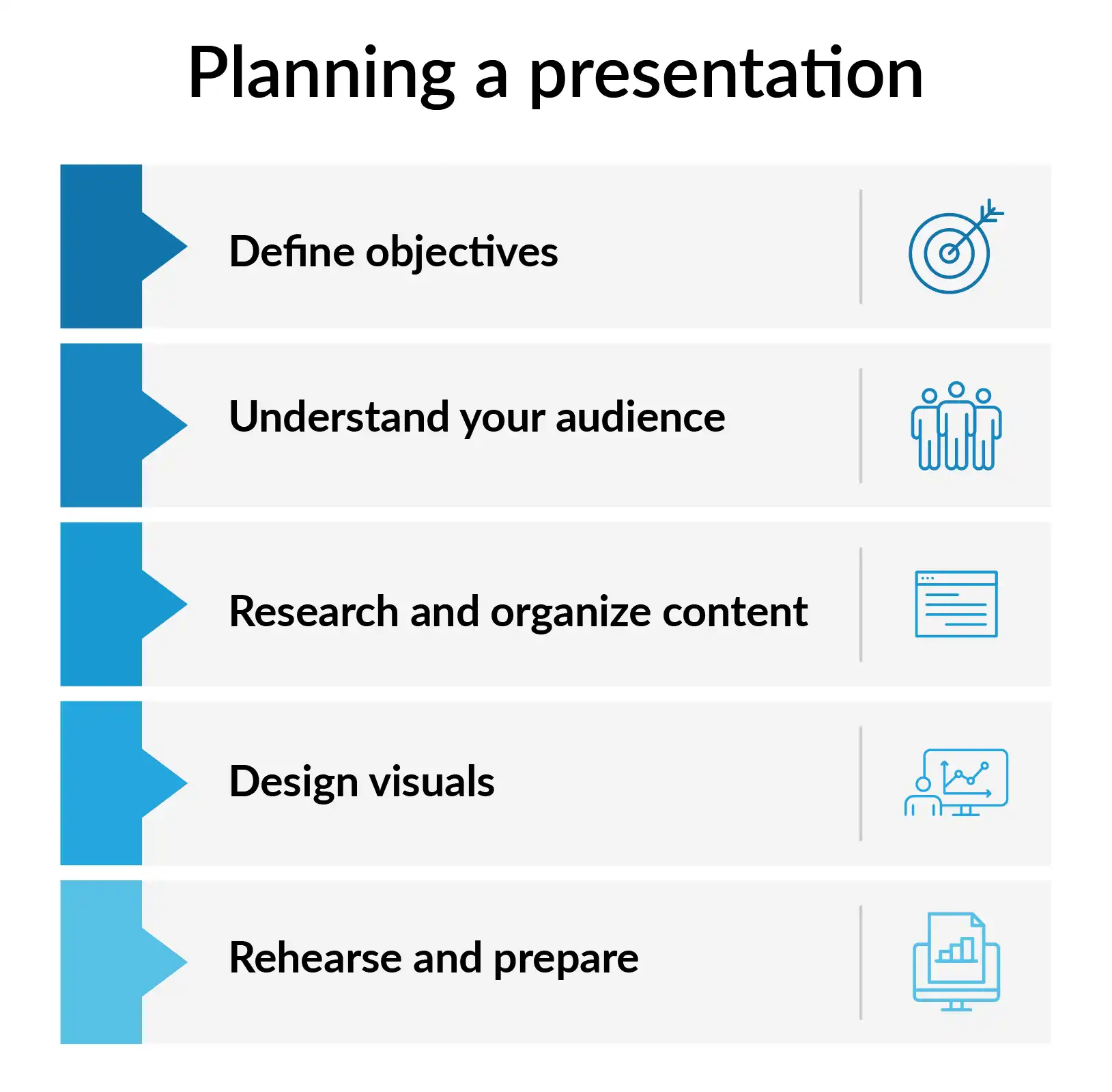
The ideal number of slides for different presentation durations
Different times for presentations need different numbers of slides. Here is a list with the best slide counts for different lengths:
5-minute presentation:
Five to seven slides are typically sufficient for a brief 5-minute presentation. Each slide should convey a critical point, such as a problem statement, solution, and conclusion. For instance, if you’re giving a quick pitch on a new product, your slides might include an introduction to the product, its unique features, and a call to action.
10-minute presentation:
10 slides for a 10-minute presentation is ideal. This allows detailed explanations of the topic while keeping a very good pace. For example, one 10-minute PowerPoint presentation on social media marketing could discuss strategy, tools, case studies, and critical points.
15-minute presentation:
With 12-15 slides, the subject can be elaborated on. For instance, in the case of financial planning, slides may cover budgeting, strategies for investment, risk management, and economic goals to give a view in totality.
30-minute presentation:
15-20 slides for a 30 minute presentation is good. This number of slides lets you explain topics well and keep the audience interested. An example is The training on project management methods, with slides about techniques, tools, real-life examples, and best practices.
45-minute presentation:
20 to 30 slides for a 45 minute presentation is ideal. This longer time allows for deep discussions, question-and-answer sessions, and interactive parts. For example, a 45-minute workshop about leadership skills might have detailed slides about different leadership styles, how teams work together, and hands-on activities.
How do you balance the slide count and content?
An impactful presentation must balance the number of slides and the level of detail on each subject. It is a balanced presentation, keeping your audience tuned to your key messages.
A balance can be achieved by, for example, having about 15 slides in a presentation on customer service excellence. This will ensure that at least one key point is highlighted per slide, such as customer feedback, service standards, and case studies. A lesser number would leave out most of the valuable details; more would confuse the audience.
An effective presentation is one in which slides complement and do not replace your verbal delivery. Charts, graphs, or images should be used to reinforce your story and build understanding. The text and details on the slide need to be kept at a minimum; focus on key points supported with a few bullet points or phrases.
Try storytelling, anecdotes, or examples to help the audience relate to or remember the information better. For example, while presenting data on service improvement, share a story about customer success to draw a softer storyline among the audience.
Regularly review and revise your slides to keep them consonant with your presentation goals. Ongoing feedback from colleagues or practice in front of a test audience will also help you finalize your content and balance of slides. So, the length of the presentation is perfect.
Per slide considerations: Words and time management
Effective time management during a presentation involves managing both the content and the visual elements of each slide. Structure your presentations accordingly. The presentation time needs to be set beforehand.
One of the best practices with slides is to use as little text as possible on any one slide to avoid overwhelming the reader so your message will be specific and focused.
For instance, a slide should have 6-7 lines of text, no more than 6-7 words on each line. The "6x6 rule" is one rule of thumb that helps with conciseness and readability of text. Suppose you are giving a presentation on key ways of effective communication. You may have a slide with "Active Listening," "Clear Messaging," and "Feedback," each list item having a brief explanation.
Include graphs, charts, and other images that complement your text and add aesthetic value to your slide.
Allow yourself effective time management: Practice and time your presentation so you will know if you have too many or too few slides and too much or too little information on each. If your time falls short, the option for simplification may well be the choice, or combining slides will also be a good alternative to keeping your presentation within the allotted time and it balances the length of your presentation.
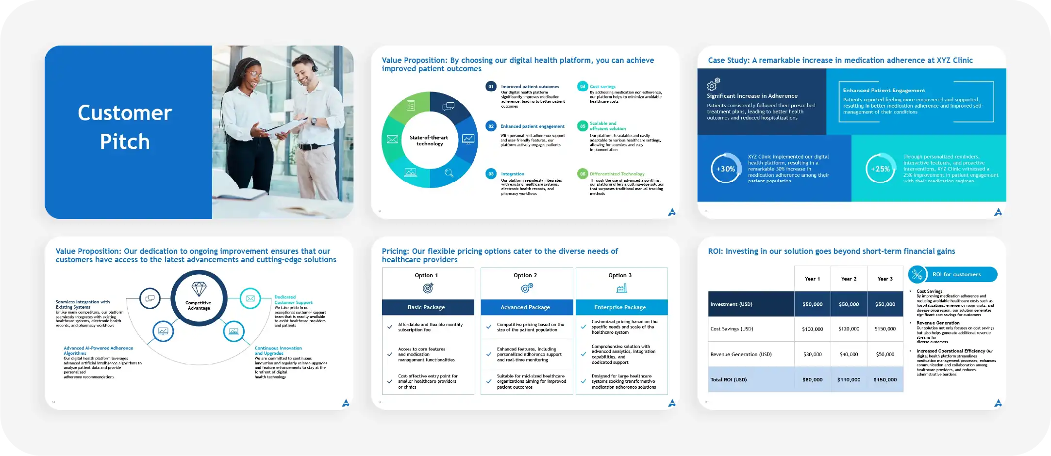
Adjusting your slide count based on feedback and audience needs
This involves adjusting the number of your slides, taking into account feedback and the needs of the audience. Flexibility in developing a presentation allows you to make it more responsive to the needs of your audience and context.
For example, if your feedback is that the presentation has catchy parts, you would develop those parts further and add slides with more information on them. Alternatively, you could condense or summarize the slides if they do not resonate with your audience.
If your presentation is interactive or includes audience participation, you may have to reduce the number of slides to include such activities. You can actually adjust in real-time as you observe audience reactions and responses to your presentation.
For example, if you happen to feel that the audience is in demand for a certain area of interest, then it will be proper to expound on that and adjust the slides or the content. Your presentation is likely to remain relevant to your audience and always be engaging when you regularly review feedback and are always ready to make such adjustments.
Examples: successful 30-minute presentations
Analyzing successful 30-minute presentations gives one an idea of the practical usage and techniques of slides. Multiple examples and case studies will be shown that help explain how different speakers handled slide counts and content delivery.
Example 1:
A TED Talk on innovation
Having 15-20 slides focused on trending technologies, case studies, and future trends.
- Introduction slide: The presentation should include a provocative image or question to capture the attention of your audience. Sets the scene for the topic and engages the audience. 1-2 slides to introduce core themes and the relevance of innovation. For example, this slide may be a timeline that gives historical context over key innovations shaping the industry.
- Breakthrough technologies: 4-6 slides, each about one breakthrough technology. The supporting slides for such technologies could be infographics, diagrams, and before-and-after comparisons that show, instead of tell, the effect these technologies have.
- Case studies: 4-5 slides regarding real-life use cases of innovation. Each would present a case study with photos, charts, and short video clips that make the stories more interesting. Future trends might be two slides speculating where innovation will go. These could include trend lines, forecasts, and conceptual images that speculate on what changes may come next and what effect they might have.
- Call to action: This could be a single slide that calls the audience to think differently or take certain actions. It can be a strong quotation, a probing question, or even an invitation to further discussion.
Example 2:
Corporate training session on employee engagement
The focus should be on practical applications and interactive learning in corporate training.
Here's how a successful 30-minute session can be structured
- Slide count and content: 20 slides focusing on motivation strategies, team-building activities, and case studies
- Welcome slide: This slide sets the tone for the session with a greeting message and the overview agenda. It may include an icebreaker question or any picture related to team dynamics that may set the reader off.
- Employee engagement introduction: Slides 2 and 3 summarize employee engagement and its importance. Supporting material may include statistics, quotes from business leaders, and some form of graphic that illustrates engagement models.
- How to motivate: Slides 5 and 6 describe how to motivate employees. Each slide could include a different strategy, such as recognition programs and/or career development opportunities backed up by case studies or data.
- Team-building activities: 5-6 slides on real, effective team-building activities will be provided. This includes step-by-step instructions, photos of activities already taken, and tips on how it went off without any hitches.
- Case studies: The slides will showcase three to four different company cases where engagement strategies have been effectively employed. Most of the slides will include a short description, outcomes, and visual evidence.
- Interactive discussion: Allow 2 slides for interactive elements, such as breakout discussions or live polling. These could be question slides or vignettes that the groups will discuss, hence some interactive engagement.
- Closing and next Steps: One slide on key takeaways and actionable next steps. It could also contain contact information in case of follow-up questions or for more information.
Balancing presentation and Q&A time
During the presentation or while you end your presentation, add a quick Q&A slide.
The requirements for questions in the presentation can vary, and you need to design the presentation structure accordingly.
- Clearly set objectives for each segment:
Identify what you want to achieve through the presentation and question/answer session. Allocate time according to each segment's priority and complexity so that important points can be covered within the time allotted and enough time is left for good interaction.
- Q&A opportunities during the presentation:
Add in some short Q&A at strategic junctures in your presentation. For example, take a moment to answer one or two questions after explaining a huge concept to both clear the misunderstandings of the audience and retain their attention, so that the final Q&A stays more focused.
- Apply time management tools:
Inserting visual timekeepers or setting an alert for keeping a tab on the time being spent covering any particular section would help in maintaining a clear-cut balance between presentation and Q&A without rushing or neglecting either of the segments.
- Engage in pre-Q&A preparation:
Collect the questions or concerns of the audience before the actual presentation and you need to prepare answer for those questions. This can be done before the event by surveying the audience or during the event itself. This also enables you to take along common queries for your presentation and utilize more Q&A time for elaborations and discussions.
- Use a moderator:
Appoint one moderator to manage the Q&A session. The moderator could filter the questions, keep the time, and ensure that the discussion is relevant as a means of not overrunning the Q&A.
- Follow-up with additional resources:
In case of a shortage of time for Q&A, mention that follow-up materials or additional resources will be sent in regard to questions that would not be covered. In this way, all the questions will be covered, even if only a few are answered in real time.
- Dynamically change depending on audience response:
Always pay attention to audience response and level of engagement throughout your presentation. If you feel that they are restless or overly engaged, dynamically change your time allocation, allowing for more time for interaction if it seems necessary.
Common mistakes to avoid: overloading slides and content
Overloading leads to confusion, disengagement, and negative overall impact on your message. Here are few mistakes to avoid during your next presentation:
- Too much text:
The common mistake is the blabbing of too much information on each slide. For instance, a normal slide full of paragraphs will confuse the audience and their attention may be divided in places. Utilize bullet points or key phrases briefly to help note important information.
- Too many slides:
Too many slides for a 30-minute will make the presentation seem to hurry and be fragmented. For example, if it is a 30-minute presentation and it contains 40 slides, each slide will be shown for only a short time, and key information may not be covered.
- Too few slides:
Using less amount of slides can also be a problem since it may oversimplify topics that are relatively complex. For example, a presentation based on data analysis with just ten slides may have to omit some details regarding methodologies or results.
- Too many visuals:
Each one should have a specific purpose and should not be overexposed with texts or too many pictures. Here, design elements come in place the images, charts, and graphs complement your information without overwhelming your audience.
- Small font:
The size of the font must be readable from very short distance. Keep in mind how big the room is and what kind of visual acuity your audience has.
- Complicated visuals:
Avoid complicated schemes and graphs that might be difficult to understand. Label all the elements of your visuals clearly and concisely. Choose appropriate visuals that deal with your topic and support your message.
Tips for designing slides for a 30-minute presentation
Successful slide design forms the basis of any successful 30-minute presentation. A successfully designed visual display supplements your message and holds the attention of the audience. Tips for designing slides:
- Consistency in design:
Apply a consistent design to all your slides. This will include font style and color, as well as consistency in layout. Consistency in design creates a cleaner look and facilitates the process of following for an audience.
Include images, charts, and graphs which will help to display information. For example, if you have a slide on market trends, you can attach it with a bar graph showing growth rates. This helps in making the information understandable and interesting.
- Readability of text:
The text is to be readable and clear. It shall be in large fonts and high-contrast colors so that it may be easily read. Avoid too many different fonts or colors, as that may be distracting from your message.
- Layout:
Take advantage of negative space. Slides that are less cluttered and messy can help with bringing about the most important points and keeping readability high. Center key points in the slide and break down complex materials with bullet points.
- Interaction:
Think about integrative polls or questions that encourage discussion. This would allow your audience to be more interactive with the
Build engaging presentations with Prezent
With Prezent, you'll be able to construct, update, and present your presentations, which will leave a permanent mark.
Slide Library: A storage for the previously designed slide templates and slide elements. Later on, you can reach any of those professional, customizable slides at any instance to enhance the visual appeal and harmony of your presentation.
Story Builder: This is a tool that will help in structuring and organizing your presentation content into a well-told story. It helps create logical flow with a clear beginning, middle, and end to clearly and interestingly deliver your message.
Auto Generator: The facility makes slides automatically according to the inserted content and keywords. Also, streamlines the creation of slides by generating content-centric slides; all you'd actually have to do is fine-tune it, rather than building it from scratch.
Presentation Library: This is a center where you can upload and review the presentations you, or other people, build. It serves to inspire you and also acts as a reference for the creation of new ones to ensure continuity in addition to the best practice standards.




.png)
