8 tips and tricks to make a Google Slides presentation look good
A successful presentation relies on three key factors: design, content, and delivery. While many professionals prioritize content and delivery, the design is equally important. Design encompasses the visual elements used to create a set of slides—such as color, fonts, images, and animations.
The visuals create the first impression and capture the audience’s attention. Beyond aesthetics, they enhance engagement, support the speaker’s points, and aid in understanding key insights.
Google Slides is one of the most used tools for creating presentations. It offers several advantages, such as real-time collaboration, easy accessibility, and a variety of templates. However, despite these benefits, many users still struggle to create visually compelling presentations.
This step-by-step guide will help you make your Google Slides look polished, professional presentations that capture attention and effectively convey your message.
Tips and tricks to make your Google Slides look good:
Google Slides offers many functions that are often underutilized to make your Google Slides presentations stand out. Here are eight tips and tricks to enhance your slide deck.
1. Choose the right Google Slides template:
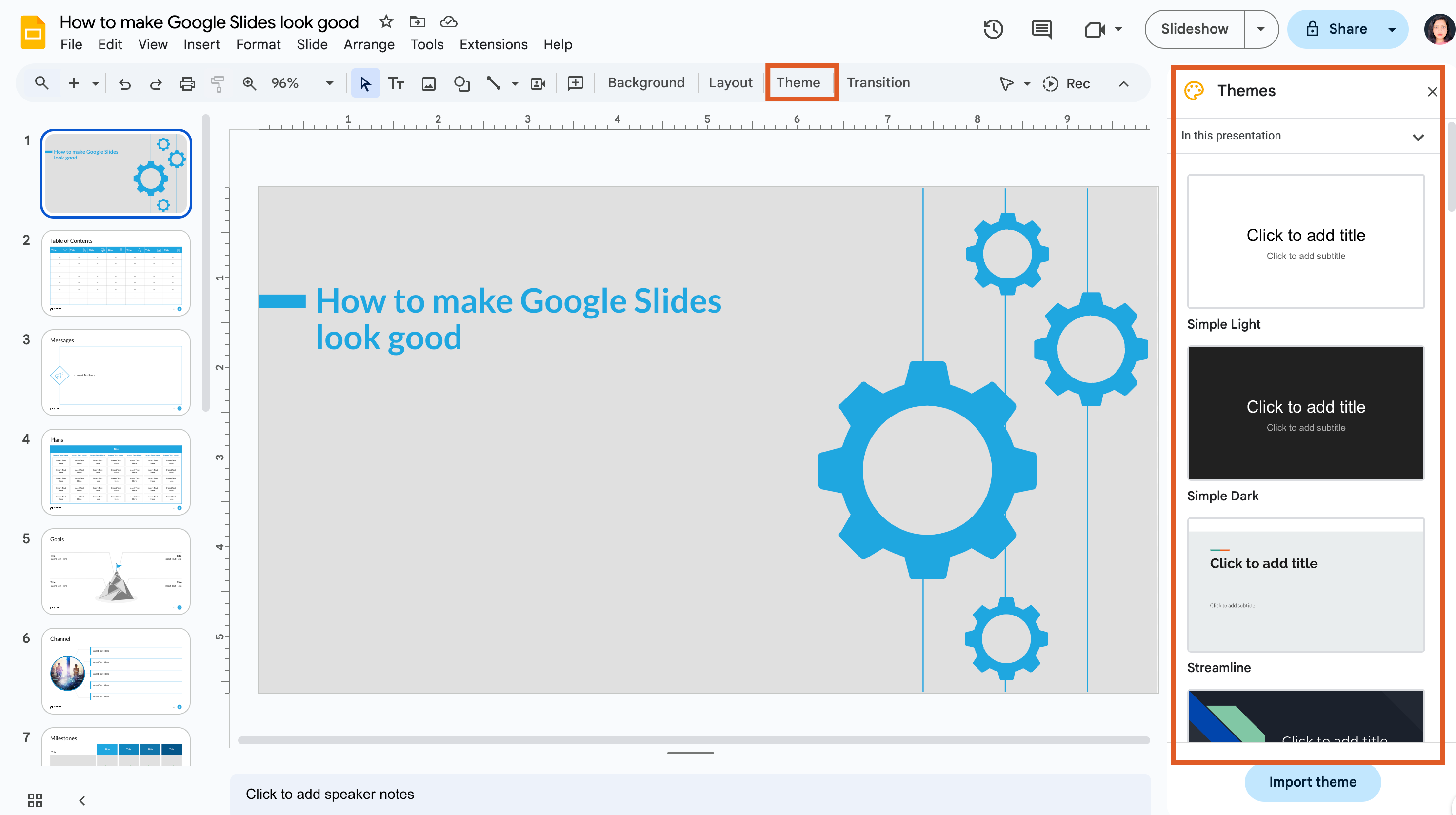
Presentation design can be time-consuming, but Google Slide theme offers over 20 default templates to simplify the process and give your presentation a cohesive look. You can also create a custom theme by importing your own or selecting fonts, colors, and backgrounds to fit your style.
Steps:
- Go to Slide> Change theme.
- Choose from available options or customize your own by editing the background and text.
Best practice: For corporate presentations, stick with a simple, professional theme. Avoid overly colorful or playful designs unless they align with your brand tone.
Tip: If Google themes seem too basic and you don’t want to create one from scratch, use the link below to explore a range of professionally designed templates and download them for easy editing in Google Slides.
2. Maintain a consistent color scheme:
Colors play a crucial role in your presentation beyond just making it look appealing. They evoke emotions, enhance audience focus, and reinforce your branding. While the right color palette can achieve these goals, poor color choices can be distracting.
Ensure there's enough contrast between your background and text for readability—light text on a dark background or dark text on a light background works best. Avoid clashing colors or hard-to-read combinations, like yellow on white. Your color choices should align with your brand and the presentation topic.
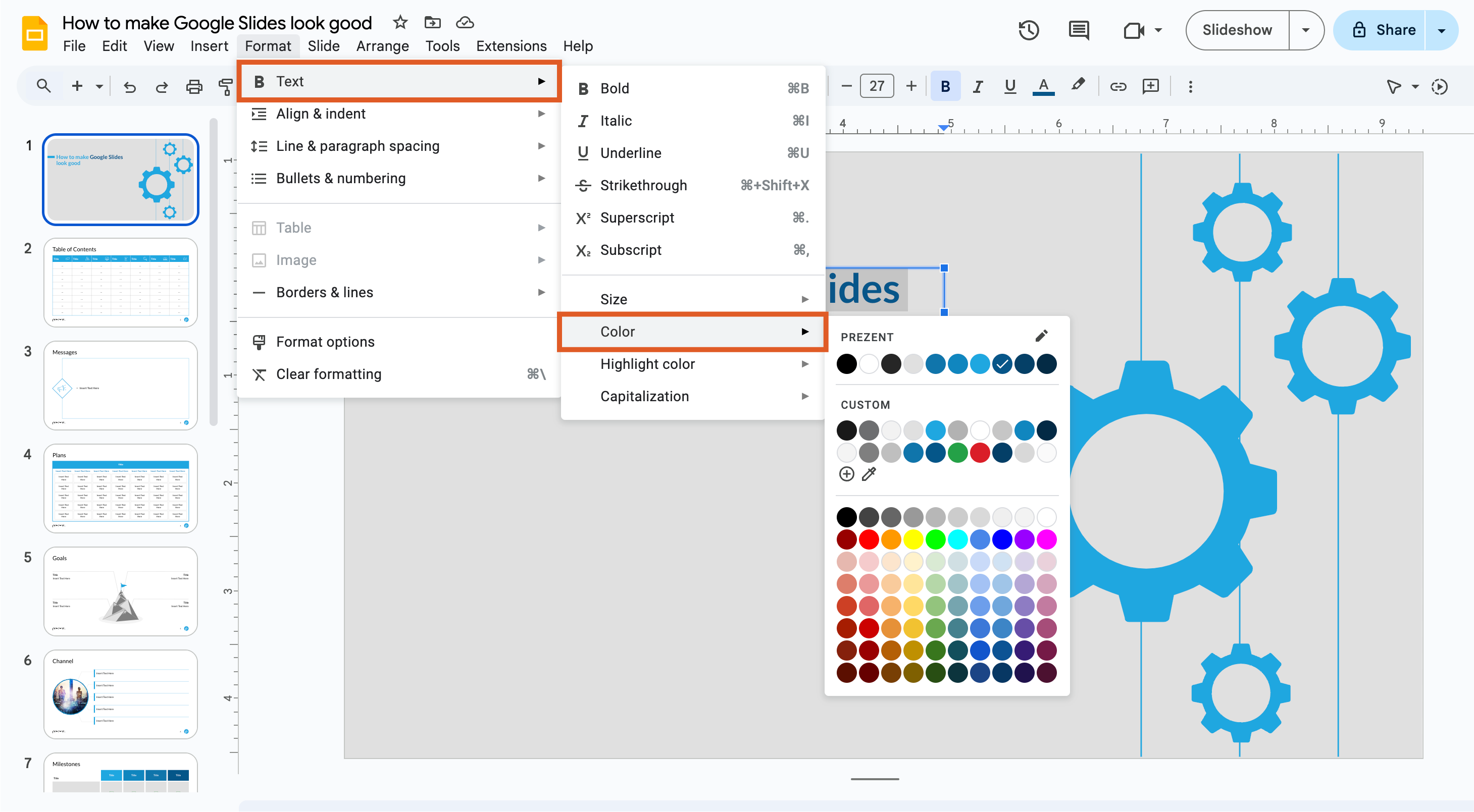
Steps:
- Highlight the text, then go to Text color (the “A” with a color bar under it).
- Choose colors that contrast well, such as white on dark blue or black on light grey.
Best practice:
As a best practice, stick to your corporate brand colors to ensure that text remains readable on all slides.
3. Keep fonts simple and readable:
Fonts may seem like a simple choice, but they significantly influence readability, visual appeal, and audience engagement. Selecting the right fonts can enhance the effectiveness of your message and contribute to a successful presentation.
Google Slides offers a variety of fonts, but it’s best to stick with simple, readable options like Arial, Roboto, and Open Sans. Avoid overly decorative fonts for body text; instead, reserve them for headings or titles when necessary.
Guy Kawasaki recommends keeping the font size at 30 points or larger to ensure clarity and readability. Additionally, fonts establish content hierarchy, so limit yourself to 2-3 fonts to maintain a clean and professional appearance while avoiding distractions.
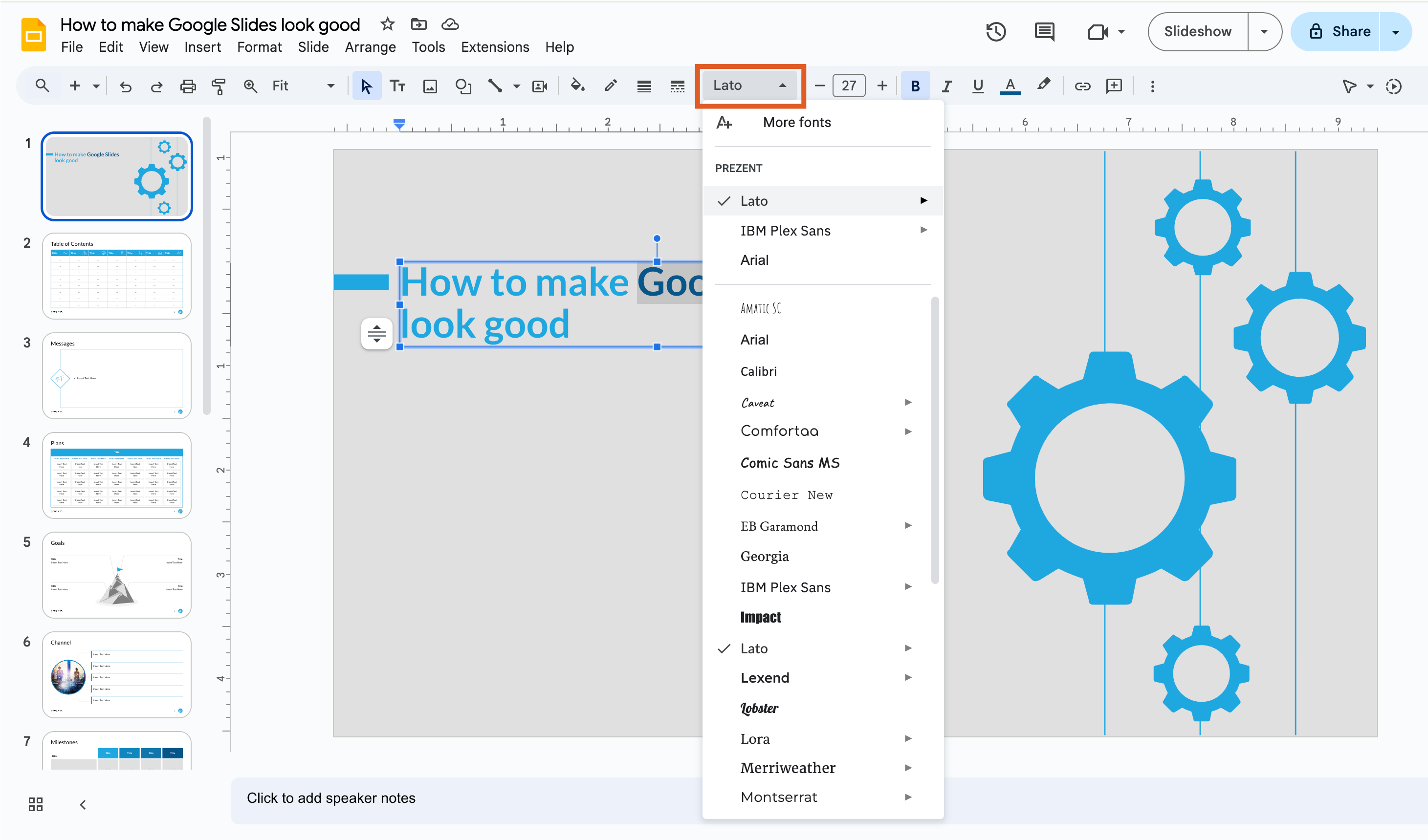
Steps:
- Select the text, then click on the Font drop-down menu.
- Google Fonts offers hundreds of choices.
Best Practice:
For corporate presentations, use your brand’s primary and secondary fonts. Ensure font sizes are appropriate: headings should be larger and more prominent than body text.
4. Use animations and transitions wisely:
The purpose of transitions in a slide presentation is multifaceted. Transitions enhance the smooth flow of information, emphasize key points, and provide a professional appeal to the presentation. When used effectively, transitions can significantly improve the overall impact of your presentation. However, overusing them can overwhelm the audience.
To maintain focus, use simple, subtle animations that enhance your message rather than distract from it. It is also a good practice to apply the same transition effect to all slides to ensure consistency throughout the presentation.
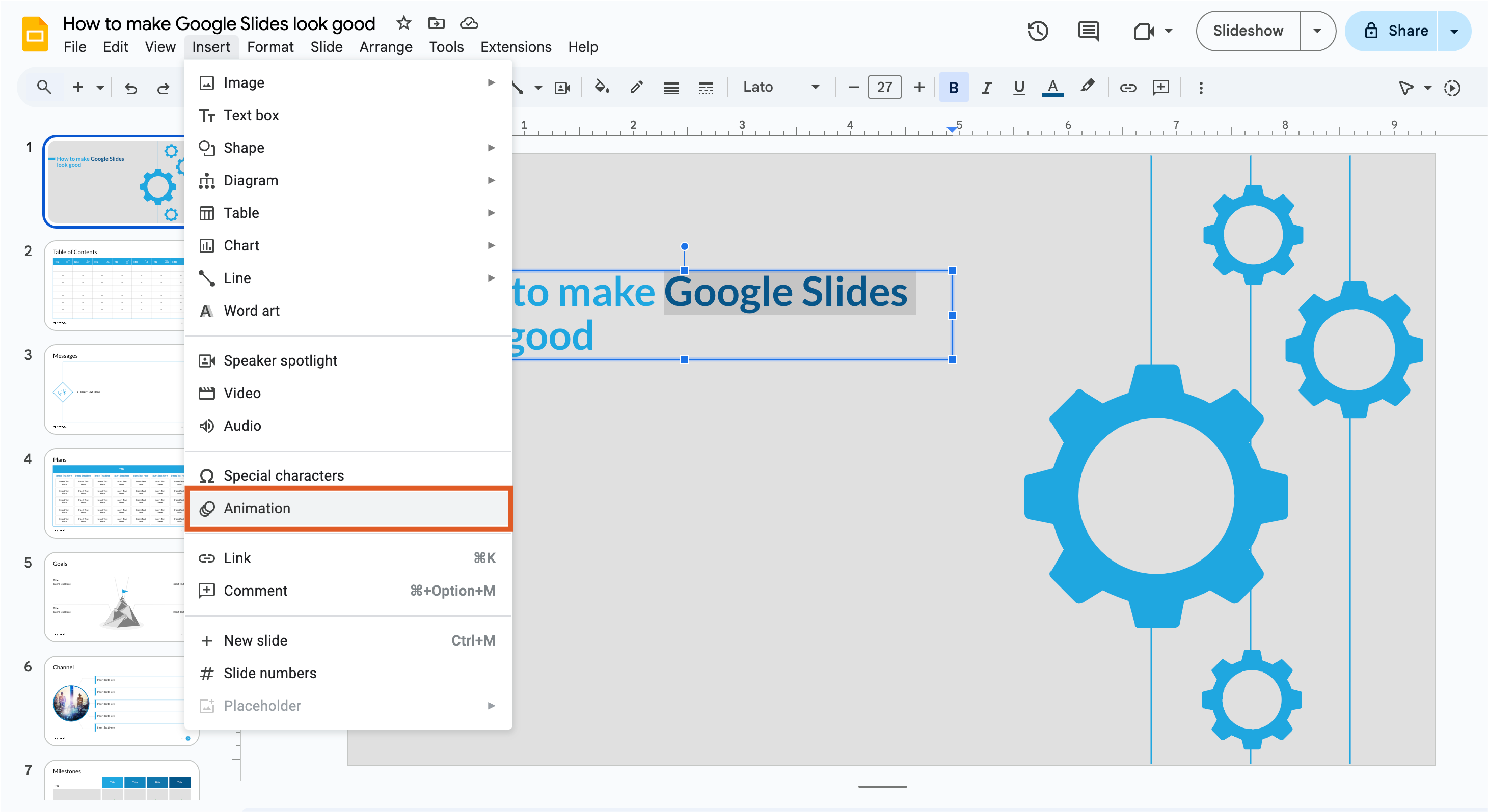
Steps:
- Select an object or text box, and click Insert > Animation.
- Choose an entrance or fade-in effect that doesn’t detract from your Slide’s content.
Best Practice:
For corporate presentations, limit animations to subtle transitions (e.g., fade-in or dissolve) to maintain a polished and professional look.
5. Use high-quality images and visuals:
Images and visuals are powerful tools that enhance engagement in your slides. They guide the presenter, reinforce key points, and evoke emotional responses from the audience. Utilizing various types of visuals can significantly improve the effectiveness and understanding of your presentation.
Images-
High-resolution images are essential for creating visually appealing slides. They can draw the audience's attention and support your message by providing context or illustrating a point. When opting for images, ensure they are relevant to your content and align with your brand’s identity. Consider using images that evoke emotion, as they can create a stronger connection with your audience.
Avoid using images that are pixelated or low-resolution, as they can detract from your presentation's professionalism. Also, limit the number of images per slide to avoid clutter, allowing each image to have a purpose.
Steps:
- Add images by clicking Insert > Image.
- Choose from various options (upload from your computer, search the web, etc.).
- Resize images while maintaining the aspect ratio (hold Shift while resizing).
Videos-
Embedding videos in your presentation breaks the monotony of a speech, engages the audience, and helps explain information more effectively. Google Slides allows you to stream videos directly from YouTube. Alternatively, you can download and upload a video through your Google Drive. However, avoid using videos that are longer than two minutes and try to limit yourself to no more than three videos in a single presentation.
Steps to embed a video in Google Slides:
- Click on the slide where you want to add the video.
- Select "Insert" from the top menu and choose "Video."
- You can search for a YouTube video or select one from your Google Drive.
- Adjust the video size and position as needed.
Infographics-
Infographics simplify complex information into easily digestible bits. These concise visuals can be used to discuss insights, explain processes, outline the scope of work, or present project timelines. Selecting the right infographic for the information you wish to convey is crucial.
3D images-
Incorporating 3D images can add depth and visual interest to your slides, making your presentation stand out. These images can provide a more immersive experience for your audience, helping them visualize complex concepts or products more effectively.
When using 3D images, ensure they are relevant and enhance your explanation. Avoid overusing 3D shapes and images, as they can become distracting. Currently, Google Slides does not offer built-in options for adding 3D shapes and images, but you can download them from external sources and insert them into your slides.
FAQ's
1. How can I make Google Slides look more professional?
To make Google Slides look good and professional, customize the master slide for a consistent design across all slides. This allows for a unified look and feel that enhances presentation quality.
2. What are some Google Slides tips and tricks for better visuals?
Adding high-quality images directly from Google, using animations and transitions, and customizing individual slides are great ways to make slides more engaging and visually appealing.
3. How do I use the master slide tool effectively?
The master slide tool in Google Slides helps maintain a cohesive look. By setting your fonts, colors, and images here, you create a consistent design across your slides effortlessly.
4. What are some ways to make individual slides stand out?
Try applying a shadow effect for Google Slides, adding unique images, or using cool Google Slides templates. This will help each single slide grab attention while aligning with the overall presentation.
5. How can animations and transitions improve my Google Slides?
Adding animations and transitions in Google Slides can make your presentation more dynamic and engaging. However, use them sparingly to avoid a cluttered or unprofessional look.
How can Prezent help you create stunning Google Slides presentations?
Creating well-designed slides from scratch can be time-consuming and challenging, especially if you're not a design expert. Prezent.ai is an AI presentation maker for executives that simplifies the process, enabling you to create stunning Google Slides presentations in a fraction of the time. Here’s how Prezent can help you learn how to make your slides stand out and look professional:
AI-driven design suggestions
Prezent uses AI to offer design recommendations based on your content, ensuring your Google Slides look cool and visually appealing. This eliminates the guesswork involved in slide design, making it easier to make your presentation look polished and professional.
Ready-made templates
Prezent offers a library of more than 35k customizable templates that cater to various industries and presentation needs. These templates help you make your slides with best practices in mind, so you can start with a solid foundation and make your Google Slides presentation interactive. These templates can be easily downloaded and are fully compatible with Google Slides or PowerPoint.
Brand consistency
For organizations, maintaining brand consistency across the slides in their presentations is crucial. Prezent ensures that your slides adhere to your brand guidelines by incorporating brand elements like logos, colors, and fonts across all slides. Additionally, for more complex needs, Prezent offers corporate presentation design services to elevate the overall look and feel of your slides.
Collaboration and feedback
Prezent allows teams to collaborate seamlessly on presentations. You can share your slides, gather feedback in real-time, and make quick edits. It's a great way to make your presentations more efficient while ensuring they meet high design standards.
Instant personalization
The platform hyper-personalizes your presentations based on your audience and objectives. Whether you’re creating a report for executives or pitching to clients, Prezent tailors your presentations to ensure they resonate with your target audience.
Learn more about Prezent's capabilities by scheduling a demo to discover how you can use Google Slides more effectively. You can also explore the AI platform firsthand with a free trial.
