10 powerful visual storytelling examples for successful presentations

Visuals play a huge role in simplifying information that might otherwise be difficult to explain. A common example is public transit systems like the subway. The color-coded lines, symbols, and maps simplify the route for you so you clearly know which color you have to follow to reach your destination. This is the power of visual storytelling.
In this article, we'll explore what visual storytelling is and how to use it in business communications to transform complex details into engaging and memorable experiences.
What is visual storytelling?
When information is conveyed through visuals like images, graphics, videos, and data visualizations to enhance the narrative, it is known as visual storytelling. This approach combines storytelling with visuals, enabling audiences to understand information quickly and form an emotional connection with the content. This technique transforms abstract ideas into something relatable and impactful, whether you’re presenting data, sharing a vision, or illustrating a concept.
Why is visual storytelling important for business?
Human attention is fleeting, and with the rise of numerous social platforms, it’s shrinking even further. Research shows that the average human attention span is just 8.25 seconds—less than that of a goldfish. In such scenarios, use of visual storytelling plays a crucial role in capturing attention by creating quick connections and making a significant impact on enhancing information retention.
In business, visual narrative is essential. It simplifies complex information, engages people more effectively, and builds a stronger emotional connection. By incorporating this technique into brand content marketing strategies, such as ads, and business communications, like presentations, businesses can make their messages clearer, more memorable, and more engaging.
Harnessing the power of visual storytelling: Nike
Take Nike’s ‘Just Do It’ campaign as an example. It perfectly illustrates how to tell a story through visuals. What did they do in this campaign that each one of us so clearly remembers?
- Imagery: Nike uses high-impact visuals of athletes in action, showcasing their determination and achievements. These images are designed to inspire and motivate viewers, reinforcing the brand’s message of perseverance and excellence.
- Brand identity: The consistent use of Nike’s iconic swoosh logo and the “Just Do It” slogan helps strengthen brand recognition and convey its values of empowerment and achievement.
- Emotional connection: By highlighting personal stories of athletes overcoming challenges, Nike creates a deep emotional resonance with its audience, making the brand more relatable and memorable.
- The campaign has been recognized over decades and has been studied for its excellence. This highlights how visual narrative offers businesses several key advantages.
- Simplifies complex information: Visual storyteller simplifies complex data and information for the audience, making it easy to understand. This is extremely useful for various business functions dealing with complex details that must be communicated clearly and quickly.
- Engages audience: Use of visual storytelling works because it captures attention and keeps audiences interested, leading to more effective communication.
- Enhances memory and retention: Visuals help in information retention. When the visuals are combined with a compelling narrative, the message can be retained better.
- Develops emotional connection: Visual storytelling is the art of evoking emotions and creating a more personal connection with the audience. This emotional engagement helps drive action and reinforces the message being communicated.

Elements of visual storytelling techniques in a presentation:
Compared to other business communication channels, presentations come with unique engagement challenges, primarily due to their length. It can be difficult for audiences to stay fully attentive and practice active listening throughout an entire presentation. However, visual content has transformed this space, making presentations more interesting, captivating, and engaging.
If you want to benefit from this technique, many aspects and elements need to be considered. Visual storytelling primarily consists of two main components: visuals (such as images, videos, infographics, data charts, etc.) and the storyline (a compelling narrative that has a logical flow).
- Story structure: Follow a traditional storyline pattern with a beginning, middle, and end. This means that your story will start with an introduction giving the background, followed by the conflict or problem statement, and at the end, it will talk about the solution.
- Imagery: Use visuals that follow a clear visual hierarchy. This helps guide the audience through the information and makes it easier to follow. Right color choices help to evoke emotions and can direct attention. For example, warm colors like red or orange can create urgency, while cooler colors like blue or green promote calm and trust.
- Logical structure: Logical structure means organizing visuals and text in a way that enhances clarity. A well-structured presentation breaks down information effectively, making the information easy to understand.
- Personalization: Understanding your audience is important to personalize the presentation as per their needs and requirements. Define the goal of your presentation and determine what specific information you want to convey to your audience from the available data sets.
- Clarity and consistency: Both visuals and the storyline should work together to simplify and support the overall message. Images should complement the text, making the content more relatable and easy to understand. Similarly, the storyline should be clear and consistent, with each part of the narrative aligning to build a cohesive message. Consistency in visuals, tone, and structure helps maintain focus and ensures that the message is not lost or misunderstood.
- Emotional connection: Creating an emotional connection through both the visuals and the storyline can deeply engage the audience. The storyline plays a huge role in establishing an emotional connection between the audience and the challenges or experiences you address in the presentation. Images, on the other hand, evoke feelings that align with the message.
Types of visual storytelling techniques for presentation:
Presentations have evolved significantly. From using prints and whiteboards to today’s multimedia PowerPoint presentations, the shift has been enormous. Technological advancements have provided us with an array of creative visuals that amplify the impact of our narrative, allowing us to convey deeper insights more effectively with the right visual aids.
There are several types of visual designs, each suited for different presentation needs. Whether you’re trying to explain data, evoke emotions, or simplify complex ideas, choosing the right type of visual can make a huge difference.
For example, an infographic can simplify complex information or processes, making them easier for the audience to follow and reducing confusion. On the other hand, various types of charts and graphs are available, designed for different data purposes, allowing you to present relevant information in a clear and effective manner. This helps convey insights quickly without requiring the audience to spend time analyzing large sets of numbers.
Below is a quick breakdown of the types of visual storytelling and their ideal use cases for easy understanding.
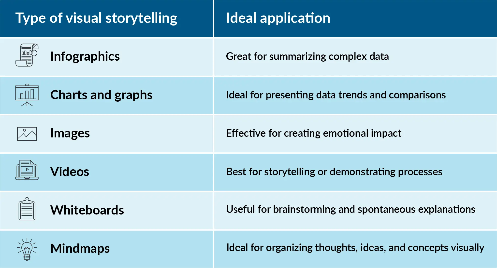
If you'd like to explore each of these visual tools deeply, check out our article on visual presentations, where we explore each type in detail with effective examples.
10 powerful visual storytelling examples for PPT slides:
Presentations can be challenging, especially when you have a lot of information to share while ensuring three major elements:
- Present all relevant data
- Avoid overwhelming your audience
- Share insights in a way that supports effective decision-making
Visual storytelling helps you achieve these goals by turning complex information into clear, engaging, and easy-to-understand visuals. By integrating visuals with your narrative, you can present data more effectively, maintain audience interest, and facilitate better decision-making. Below are 10 powerful examples that will help you to create an impact in your next presentation.
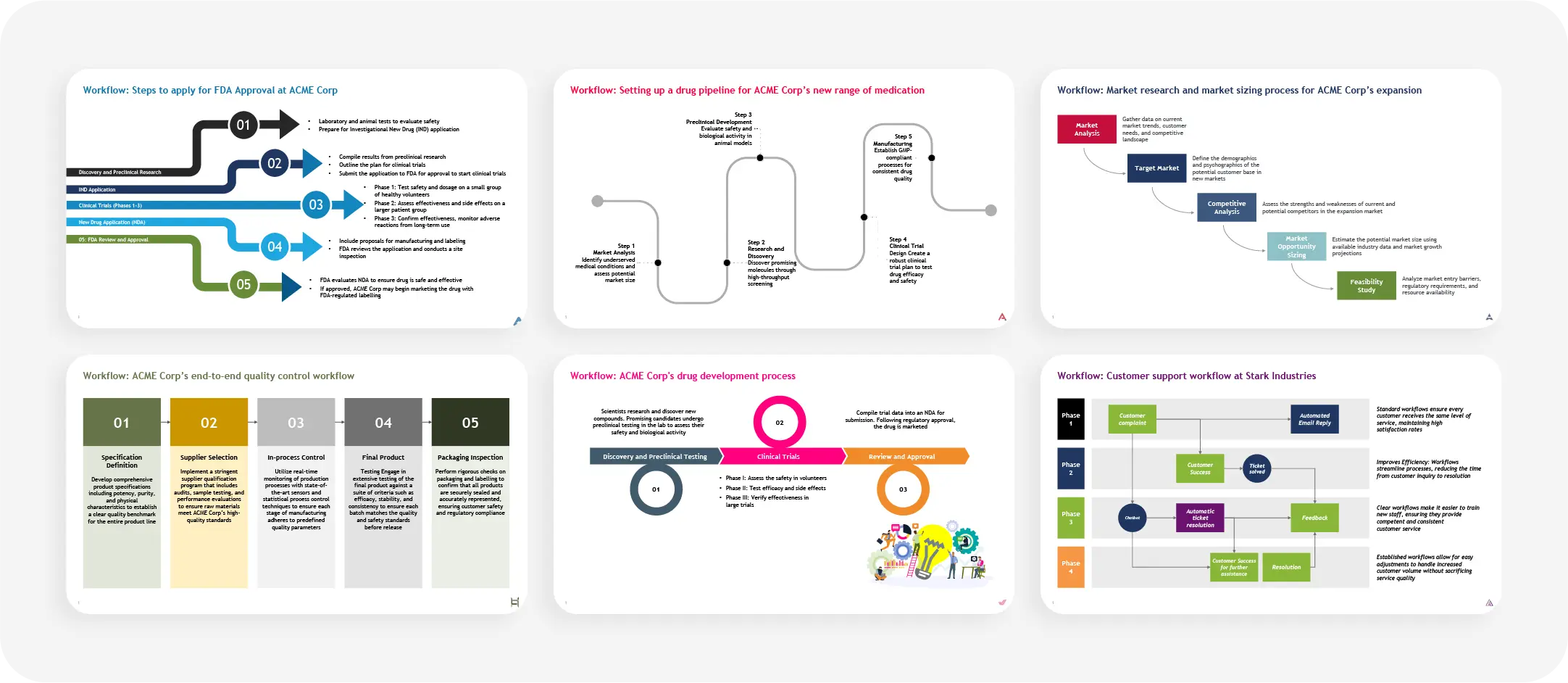
Workflow:
A workflow slide helps in visualizing processes step by step. This is the perfect slide for explaining how different tasks or phases are interconnected visually, which makes it easier for the audience to follow complex procedures or workflows. This is particularly useful in operational and project-based presentations.
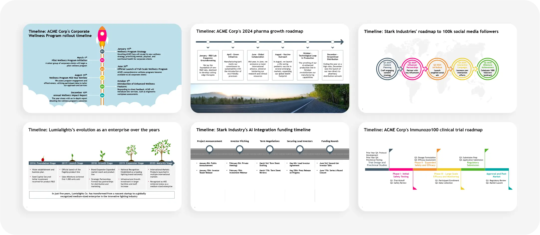
Timeline:
Timelines offer a clear, chronological overview of events or milestones. When you are presenting a project plan, company history, or product development phases, timelines visually break down each stage in an easy-to-understand format, enhancing the understanding and clarity.
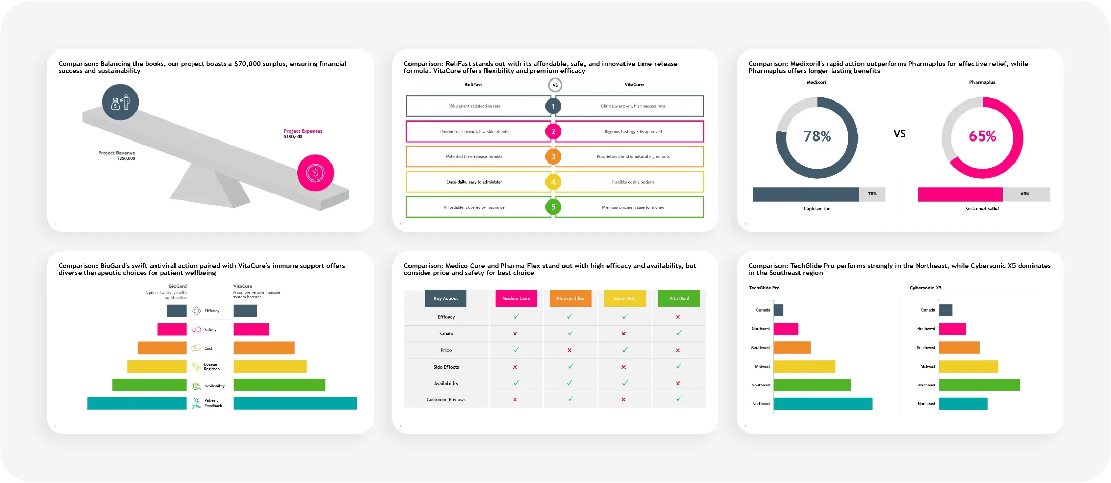
Comparison:
Comparison slides are perfect for illustrating differences between options, products, or metrics. This type of slide allows you to put two or more elements side by side to provide a comparison view. By clearly highlighting contrasts, you can simplify your audience's decision-making.
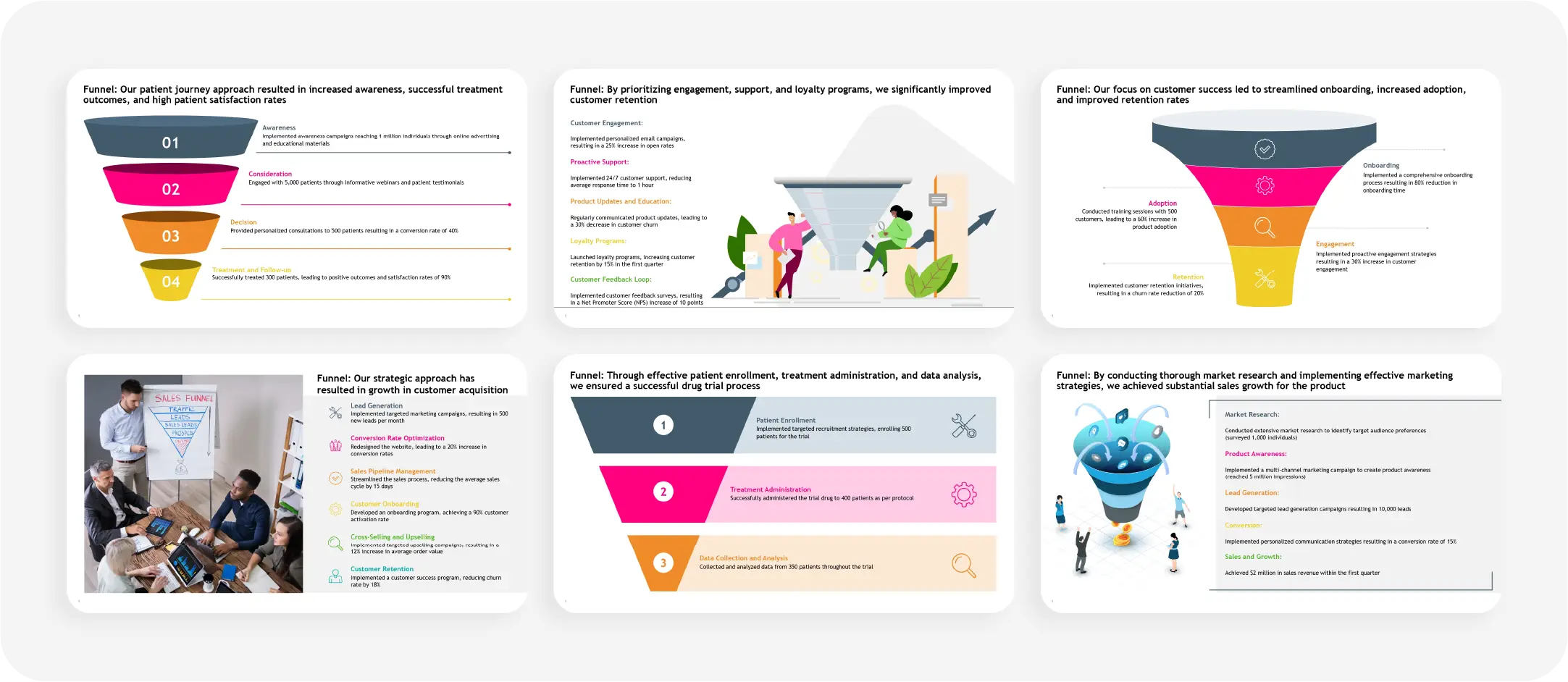
Funnel:
Funnel slides are used to represent processes that narrow down, such as sales pipelines or lead conversions. They’re particularly useful in business presentations to show how leads or information flow through stages, helping teams focus on each step’s conversion rate.
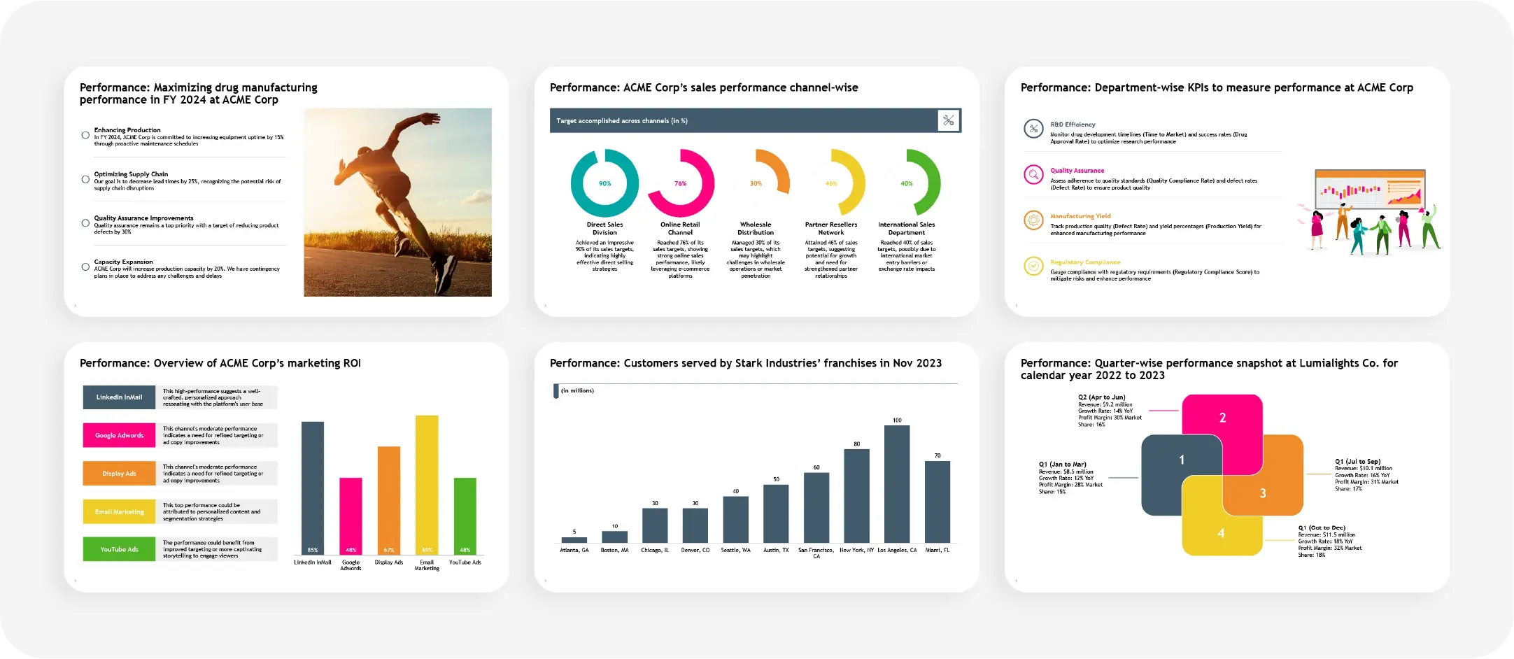
Performance:
Performance slides are designed to measure and communicate results. Whether you're presenting sales data, employee performance, or KPI metrics, performance slides help quantify success and indicate areas of improvement, driving data-based decisions.
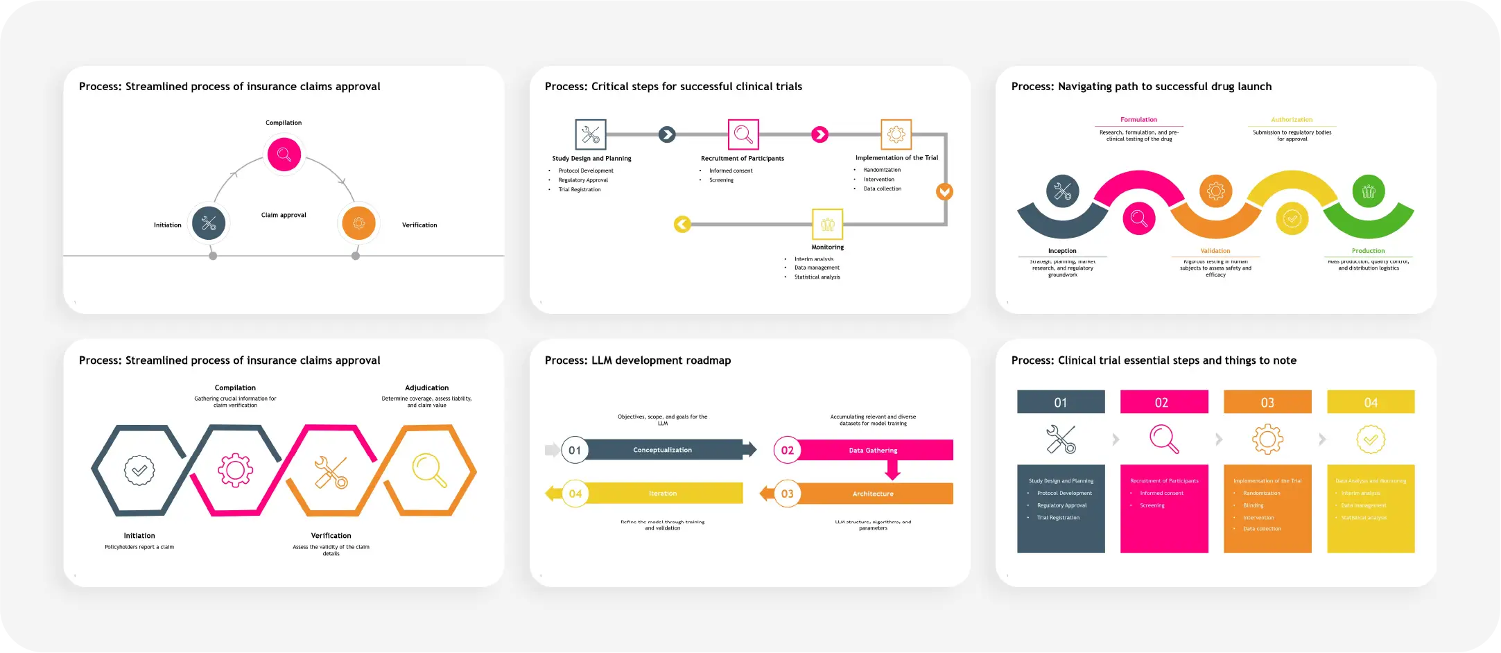
Process:
Process slides map out how things get done from start to finish. These slides are essential for demonstrating workflows, decision-making procedures, or how one phase transitions to the next, helping the audience visualize the entire process in a structured way.
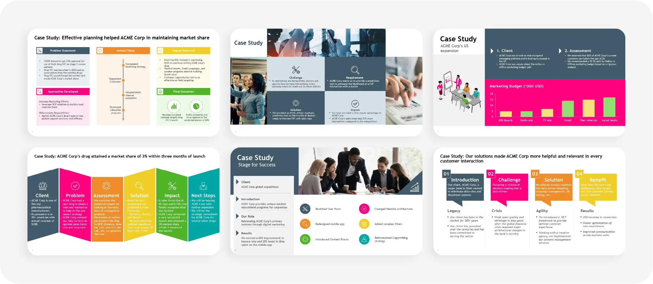
Case study:
Case study slides provide a structured way to share the success stories of how a solution, product, or service was implemented to solve a problem. These slides are highly effective in persuasive presentations, offering real-life examples that can enhance credibility.
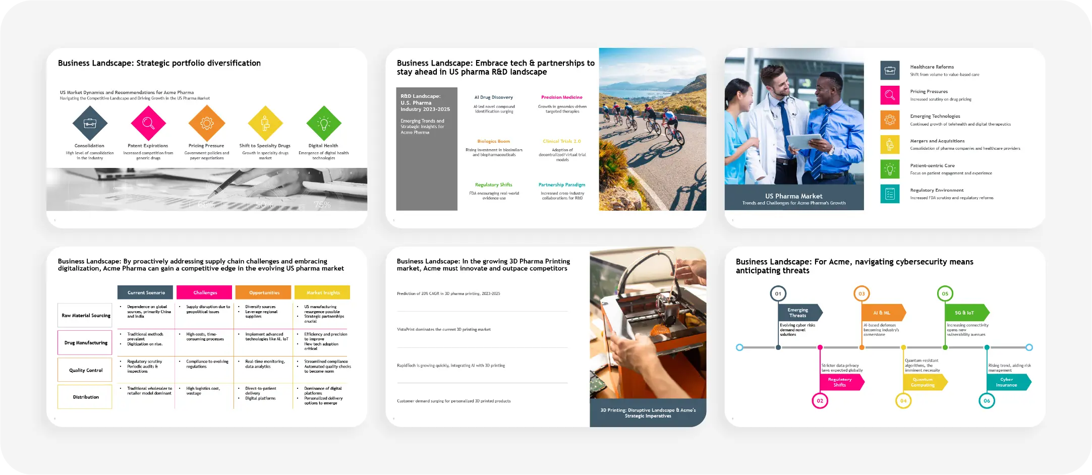
Business landscape:
A business landscape slide presents an overview of the industry, competitors, or market trends. It helps the audience quickly grasp where a business stands in the broader context of the market, making it a vital tool for strategy discussions and competitive analysis.
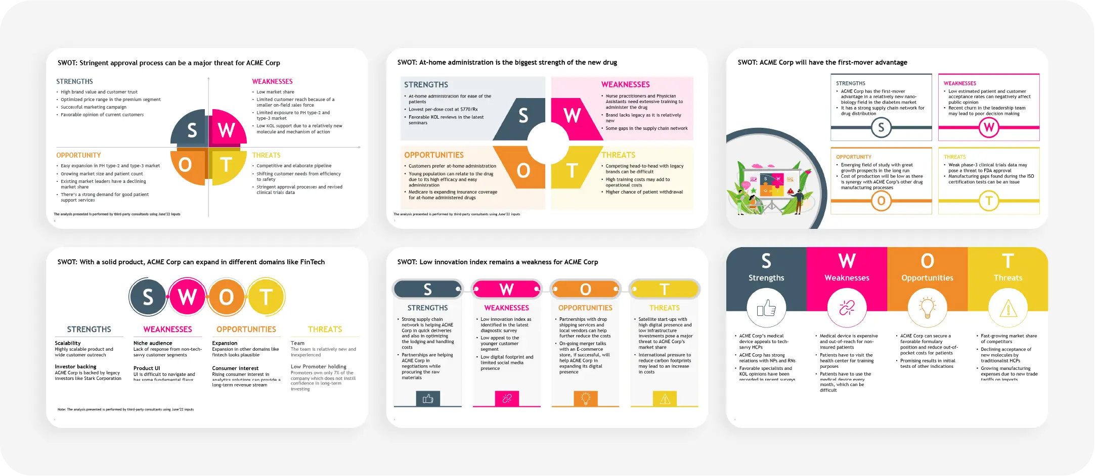
SWOT analysis:
SWOT analysis slides are designed to break down a company’s strengths, weaknesses, opportunities, and threats. These slides are useful in strategic planning, helping teams to identify key areas for improvement and capitalize on opportunities.
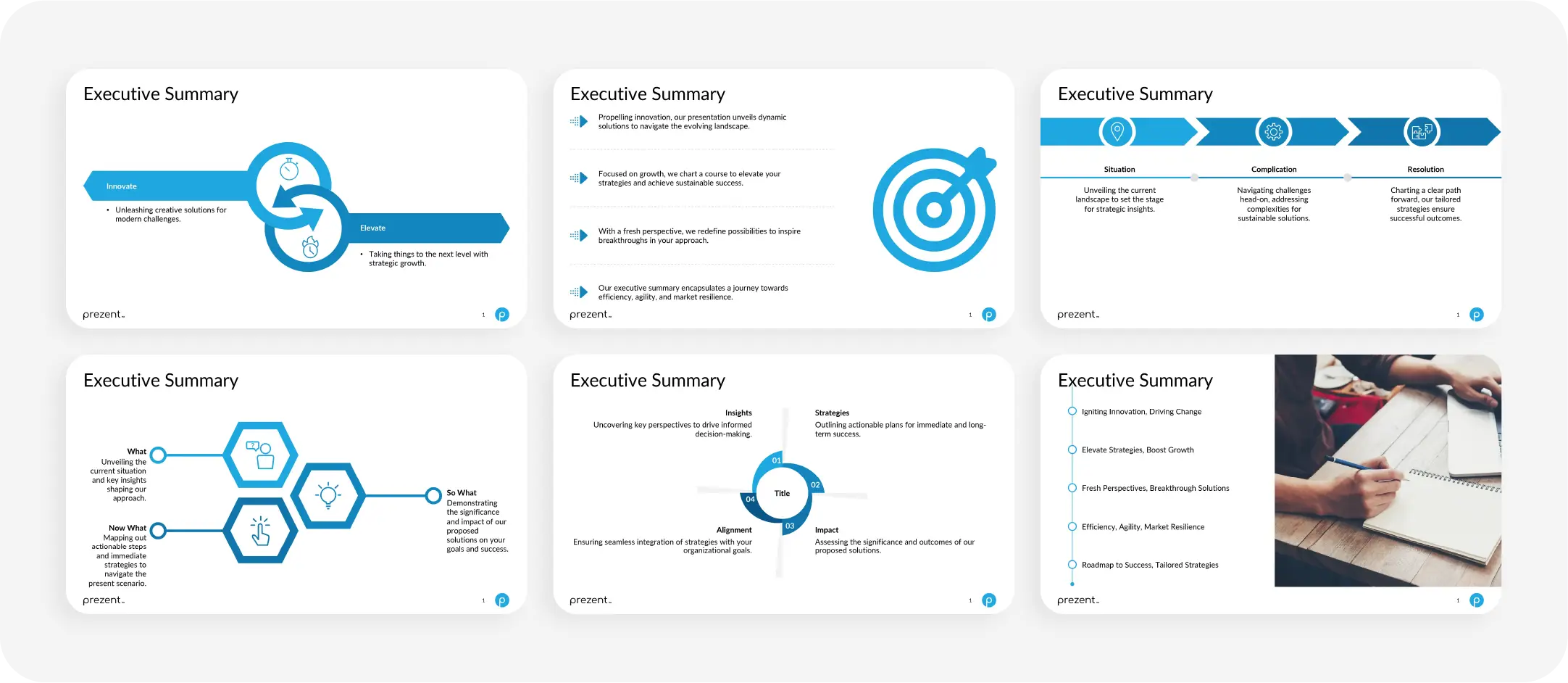
Executive summary:
Executive summary slides are usually more challenging as you have to synthesize all the insights from the presentation in a comprehensive way.
This slide is essential for giving decision-makers a quick summary of the presentation’s main takeaways, ensuring that they grasp the most important insights at a glance.
How to craft an effective visual story?
Visual storytelling is a powerful tool for engaging your audience and persuading them to take action. It allows you to build a connection through carefully chosen visuals and narratives. Mastering this art takes practice and patience, but keeping certain principles in mind can significantly enhance your storytelling skills. This section offers tips to help you hone your art of using visual narratives and highlights common pitfalls to avoid.
6 tips to help ace the in visual storytelling:
1. Know your audience
Understanding your audience is the foundation of any successful presentation. Tailor your narrative to their needs, preferences, and pain points. This allows you to personalize the story, making it more relevant and engaging. Avoid overwhelming your audience with unnecessary details; instead, focus on delivering the information they care about most.
2. Select the right story
Choose a story that fits your audience's needs and aligns with the objectives of your presentation. A well-chosen narrative fosters an emotional connection, keeping your audience engaged from start to finish. Ensure your story is clear, concise, and focused—avoid unnecessary complexity or too many subplots that could confuse your listeners.
3. Build a good story
A compelling visual story has a clear beginning, middle, and end. The narrative should flow smoothly, with each part building on the last, leading the audience to the intended message. Keep the focus on the main objective and avoid introducing too many characters or plotlines, as this can dilute your core message.
4. Use visuals effectively
Your visuals should complement and enhance your story, not distract from it. Ensure that the colors you choose evoke the right emotions and that your images are well-organized and purposeful. Cluttered, poorly arranged visuals can disrupt the flow of your narrative and distract your audience. Pay attention to image layout, positioning, and overall design to keep your presentation visually appealing and cohesive.
5. Be authentic
Convey a story with authenticity, as it is the key to making a lasting impact. If you don’t believe in your story, your audience won’t either. Speak from a place of truth and sincerity. Your genuine enthusiasm and belief in your message will resonate far more than any perfectly executed presentation.
6. Ensure technical readiness
Technical glitches can undermine the impact of even the best visual stories. Before you present, take time to test all technical aspects thoroughly. Check the flow of your slides, ensure embedded visuals and videos function correctly, and confirm that audio systems are working properly. Additionally, you should have backup solutions ready, such as alternate devices or hard copies, in case something goes wrong. Proactively addressing potential technical issues can maintain the presentation's flow and keep the audience focused on your message.
5 common mistakes in visual storytelling
1. Losing clarity
The desire to share too much information can lead to clutter and confusion. Overloading your audience with excessive details dilutes your core message and makes it harder for them to follow the story. Focus on delivering clear, concise points that align with the central theme.
2. Neglecting the power of sound
The pitch and tone of your voice play a significant role in evoking the right emotions and sentiments. Many presenters overlook this, but the way you deliver your message is just as important as the visuals. A flat or monotone delivery can detract from the impact, while a varied tone can enhance engagement and emotional connection.
3. Overemphasizing visuals
While visuals are a crucial element of storytelling, focusing too much on them can reduce your presentation to a set of pretty slides, causing the narrative to take a backseat. Striking the right balance between visuals and the story is key to keeping the presentation impactful and meaningful.
4. Ignoring the audience
Neglecting your audience is a two-fold mistake. First, your story will fail to resonate with them if you don’t consider their needs, preferences, and pain points. Second, you risk losing their attention entirely if you ignore their reactions during the presentation and fail to adjust your flow or delivery accordingly.
5. Lacking a clear call to action
A great story should inspire action, but many presentations fail by not providing the audience with a clear next step. Whether it's a decision, a change in mindset, or a specific action, ensure that your story culminates in a compelling call to action that ties everything together.
How Prezent can transform your presentations with visual storylines:
Prezent’s AI presentation software is designed to ensure every presentation you create is engaging, 100% aligned with your brand, and built on a compelling narrative—all while saving you time and effort.
- Effortless integration of compelling narratives: With Prezent's Story Builder feature, you can easily integrate visual storytelling into your presentations. Simply search from over 1,000 business case scenarios and customize them to suit your content. This feature streamlines the creation of engaging stories that simplify complex data and boost audience engagement.
- Transform raw data into impactful highlights: Prezent offers access to a vast library of over 35,000 slide templates and design elements, allowing you to turn raw data into visually compelling slides. Whether you're showcasing timelines, comparing metrics, or presenting data insights, Prezent empowers you to create slides that inform and captivate your audience.
- Simplified personalization: Personalizing your stories is a powerful way of building a connection with your audience. Prezent’s Fingerprint feature helps you bridge the gap between what you deliver and your audience's expectations by understanding their preferences, needs, and expectations. This makes it easier to customize your content and create a powerful emotional connection.
- Stay ahead with industry best practices: Presentation trends evolve constantly, and Prezent keeps you updated with its best practice library. This feature ensures your presentations are aligned with the latest industry standards and trends, helping you stay current with effective formats and styles.
There's much more to Prezent that can boost your team’s efficiency, directly contributing to your company’s growth by streamlining the presentation process. Explore Prezent’s full range of features by scheduling a demo, or take a personal tour with the free trial option to experience how it can enhance productivity and drive results for your team.
